More than a flatpack - Marketing Campaign.
Styling: Lauren Olive | Videography & Photography: Tom Witte
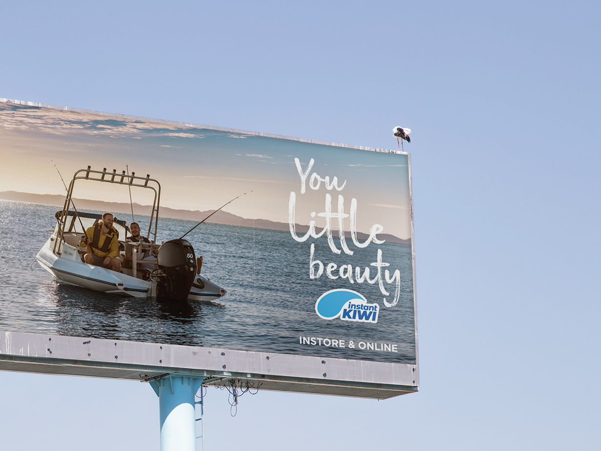
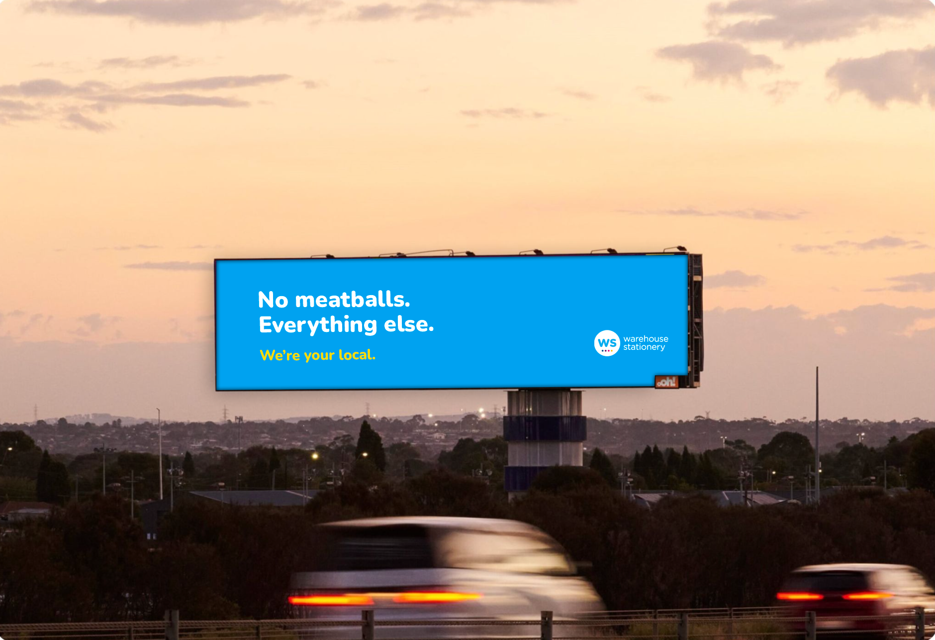
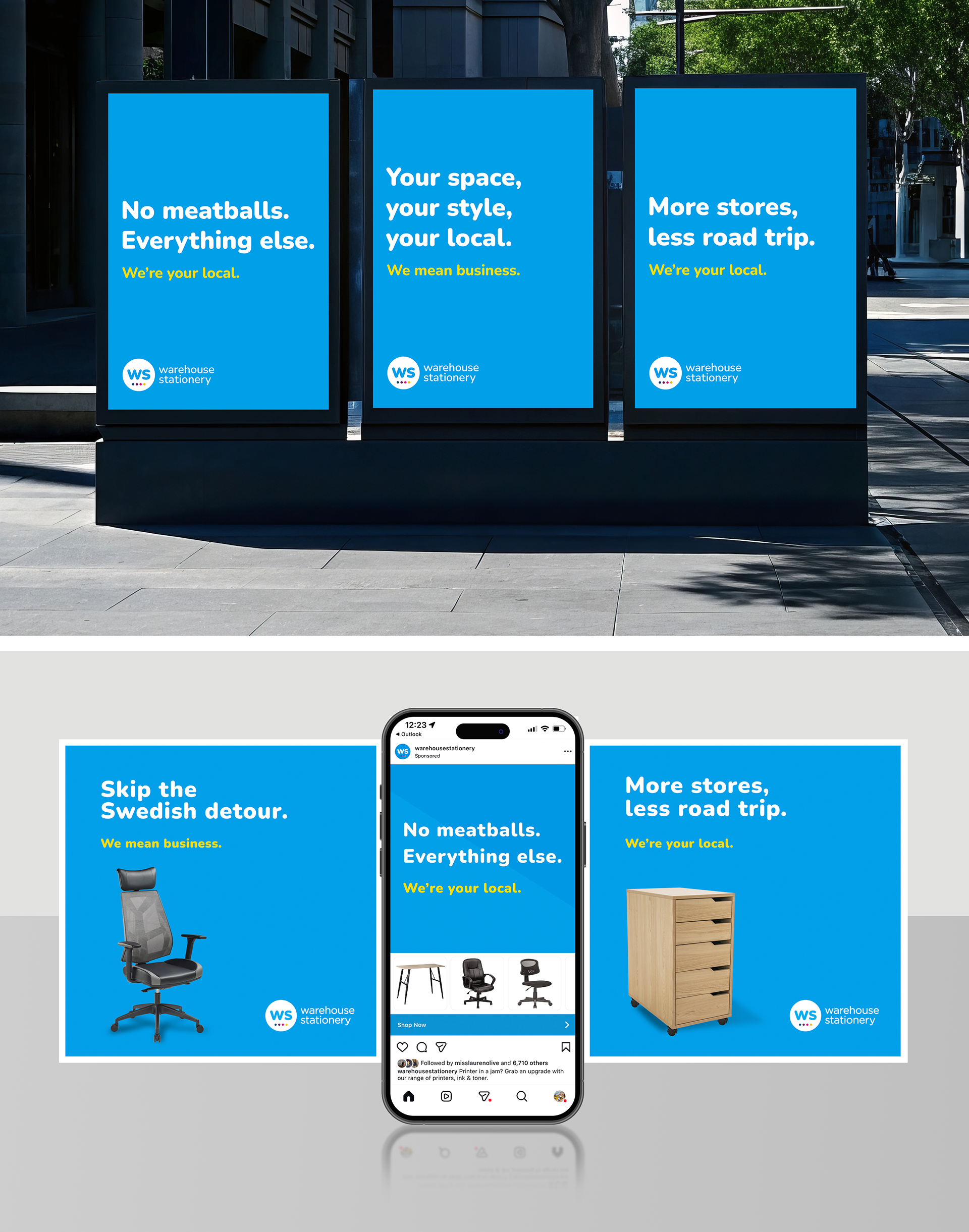
When IKEA announced its arrival in New Zealand, the retail conversation quickly became about price and scale. Competing directly would position Warehouse Stationery as the smaller alternative, a battle we would never win.
I developed the strategic positioning and creative direction for a campaign that leaned into what IKEA cannot offer: local presence, convenience and support for Kiwi households and businesses.
The work reframed Warehouse Stationery as the practical choice. Buy today, use tonight. No flatpacks, no allen keys, no frustration.
The campaign entered the national conversation and was featured on 1News during coverage of IKEA’s NZ app launch.
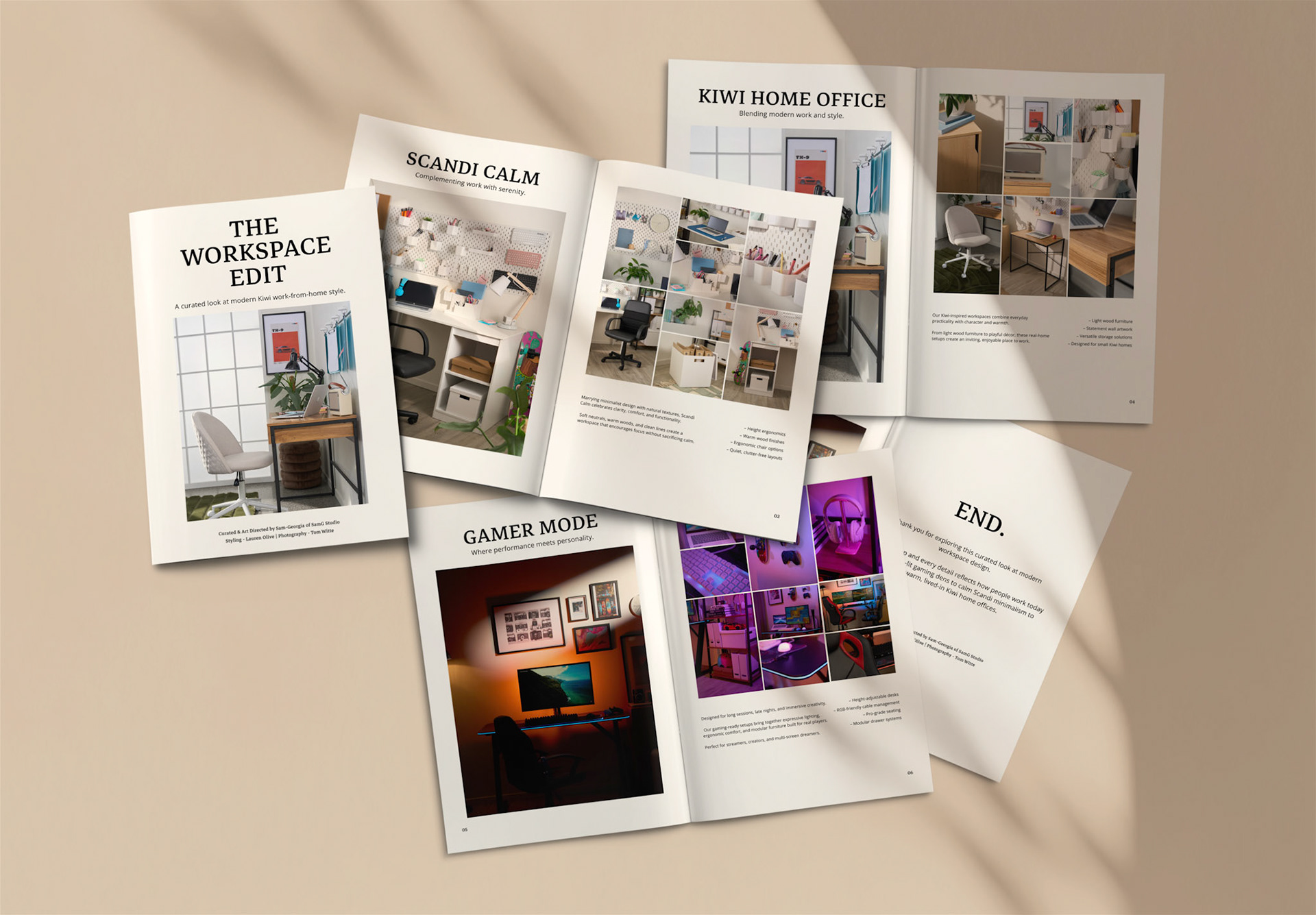
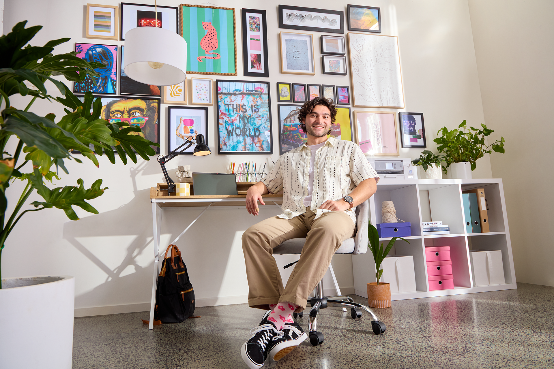
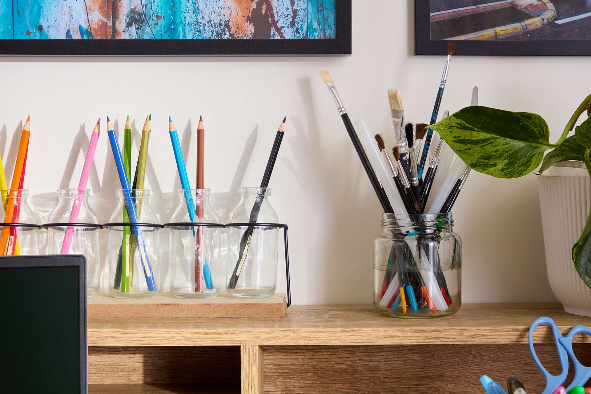
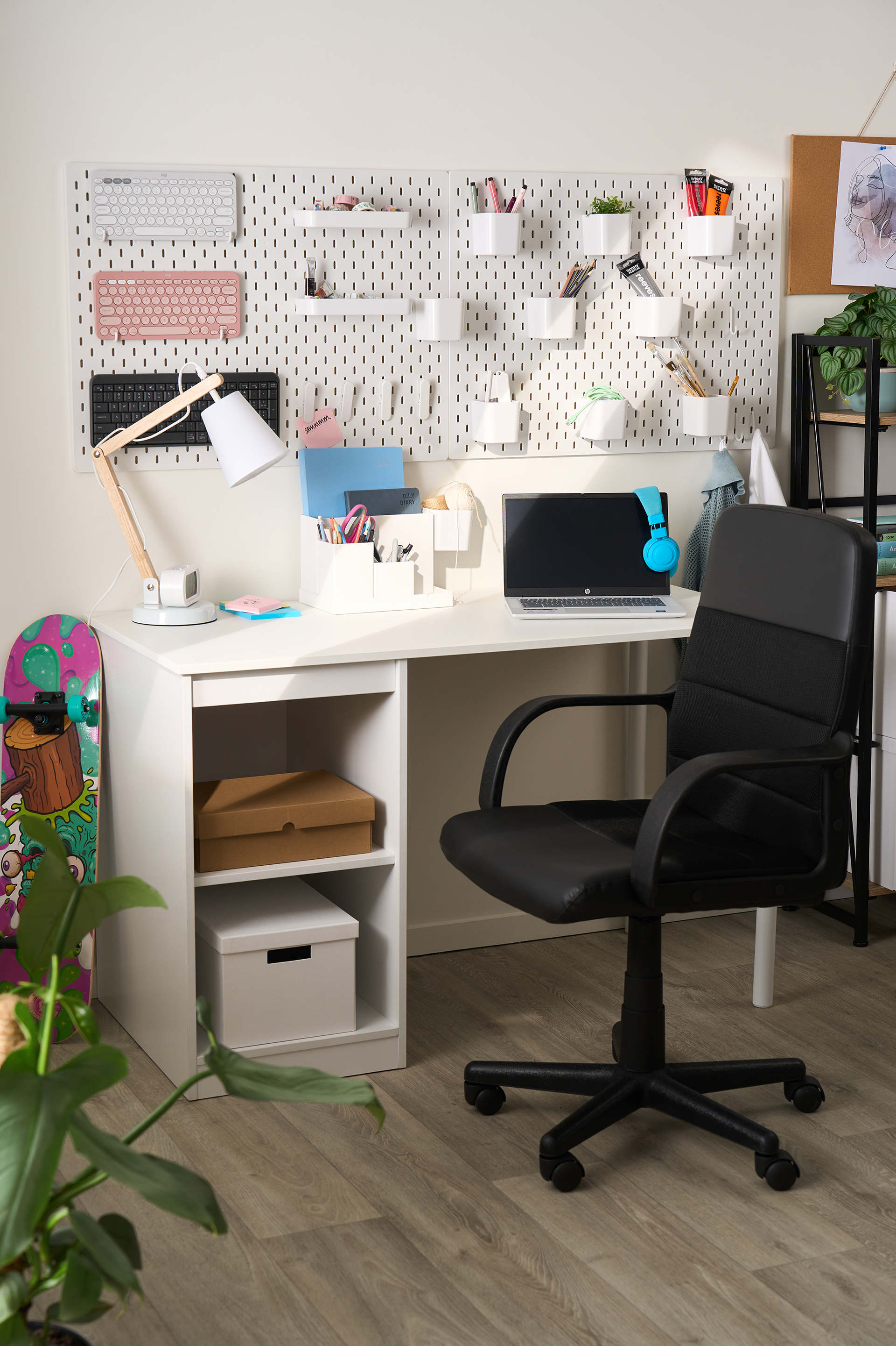
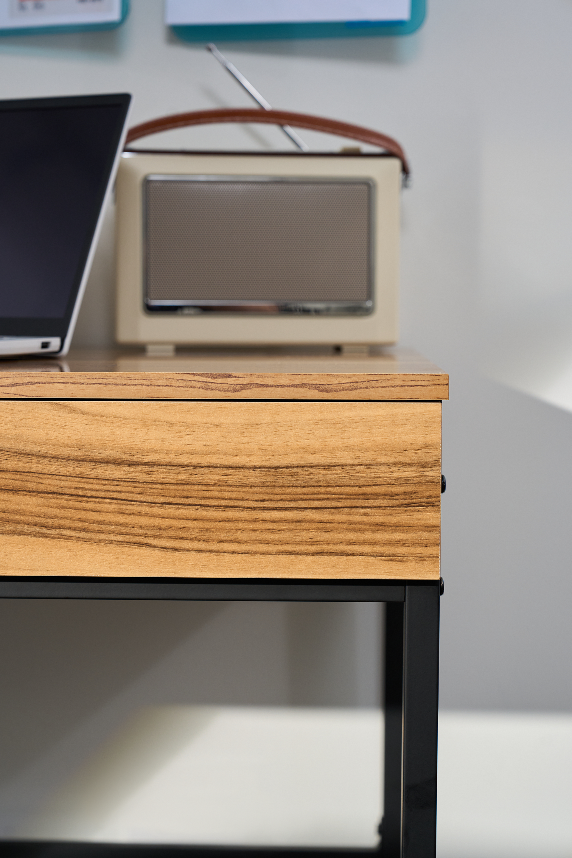
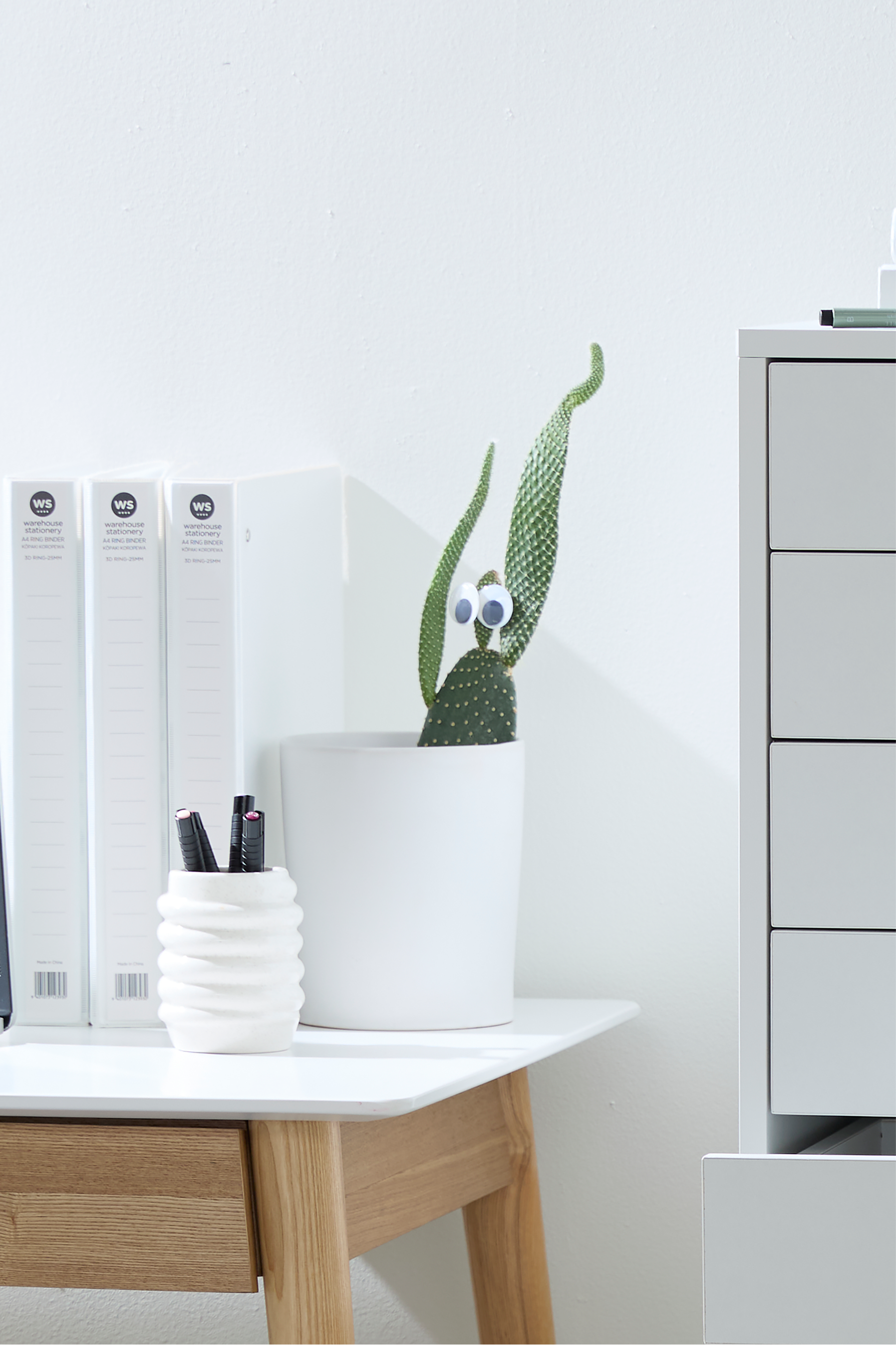
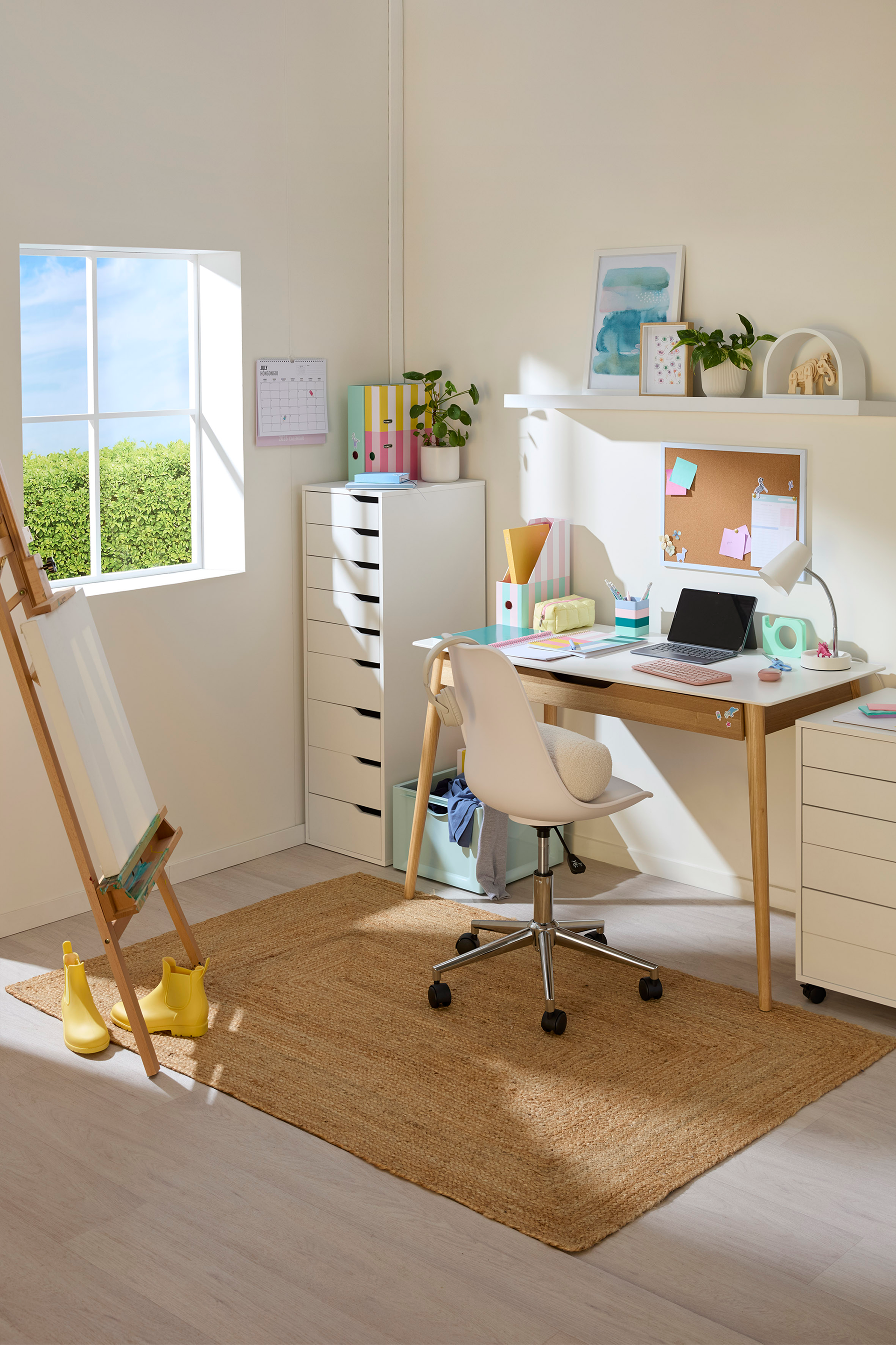
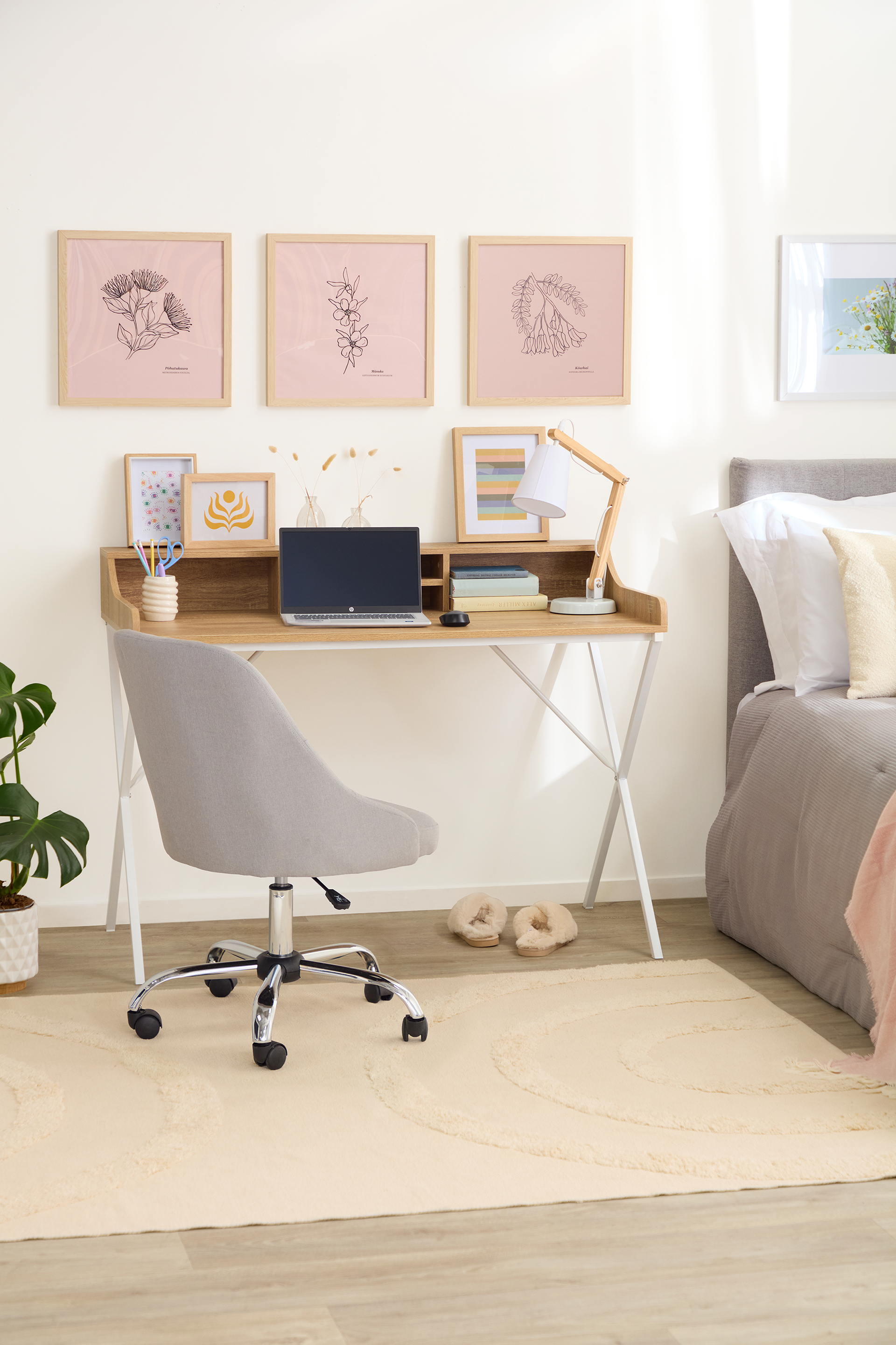
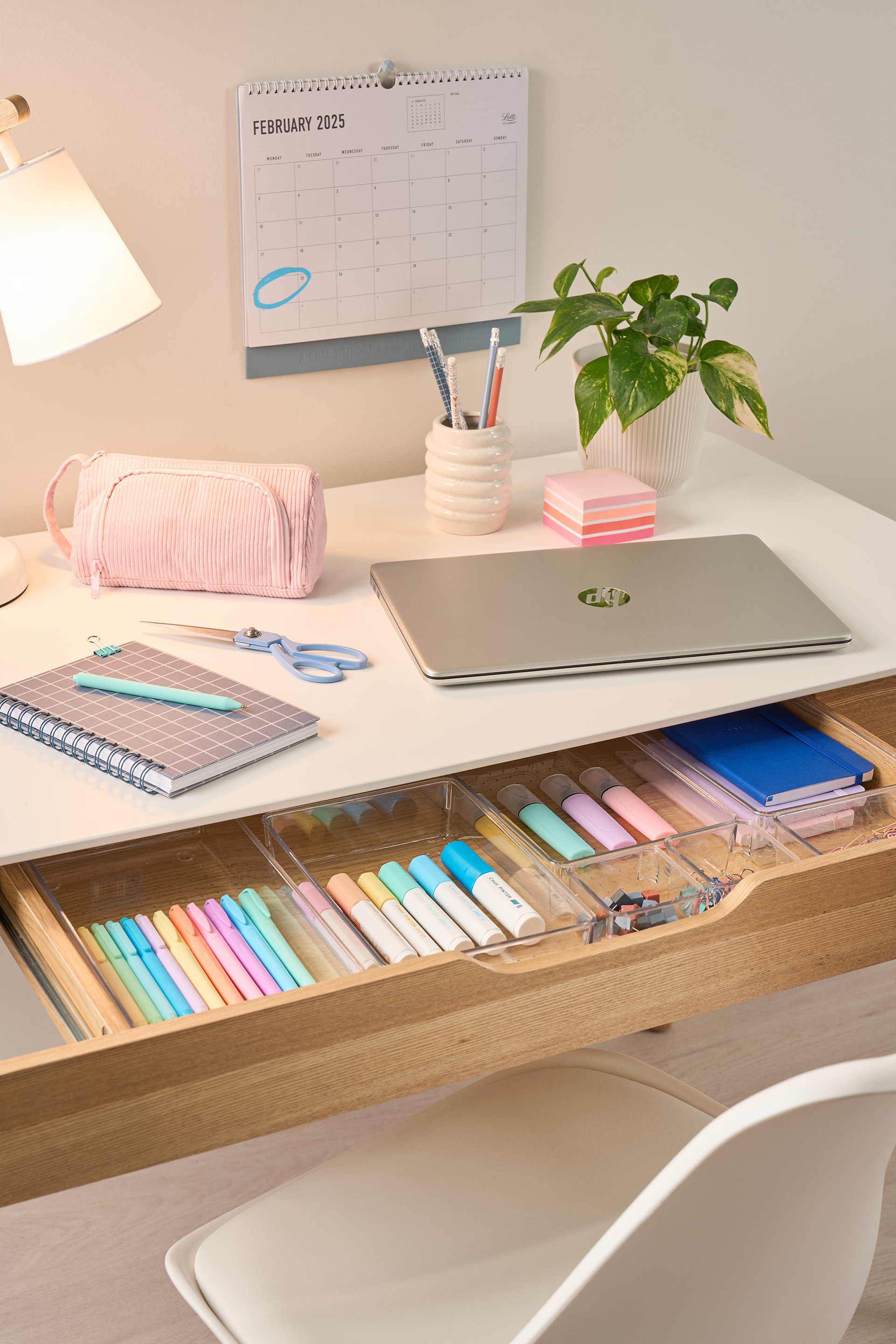
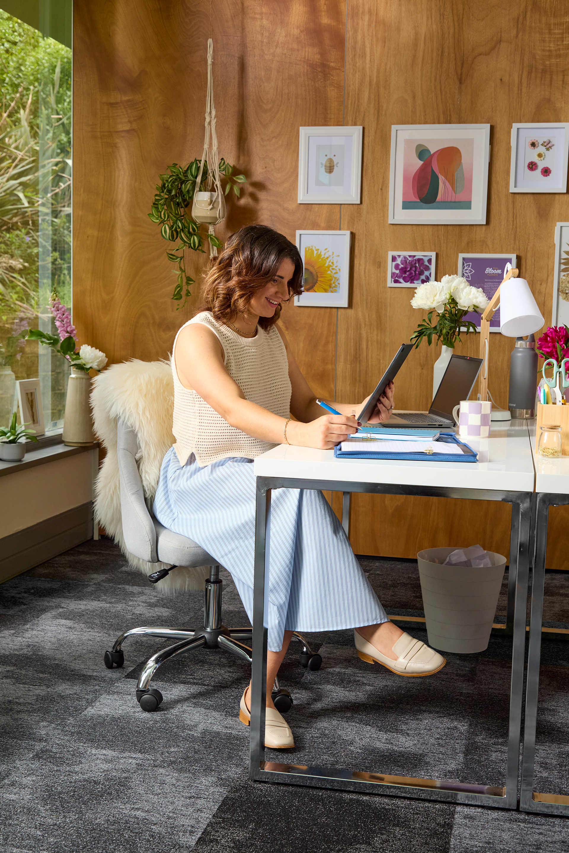
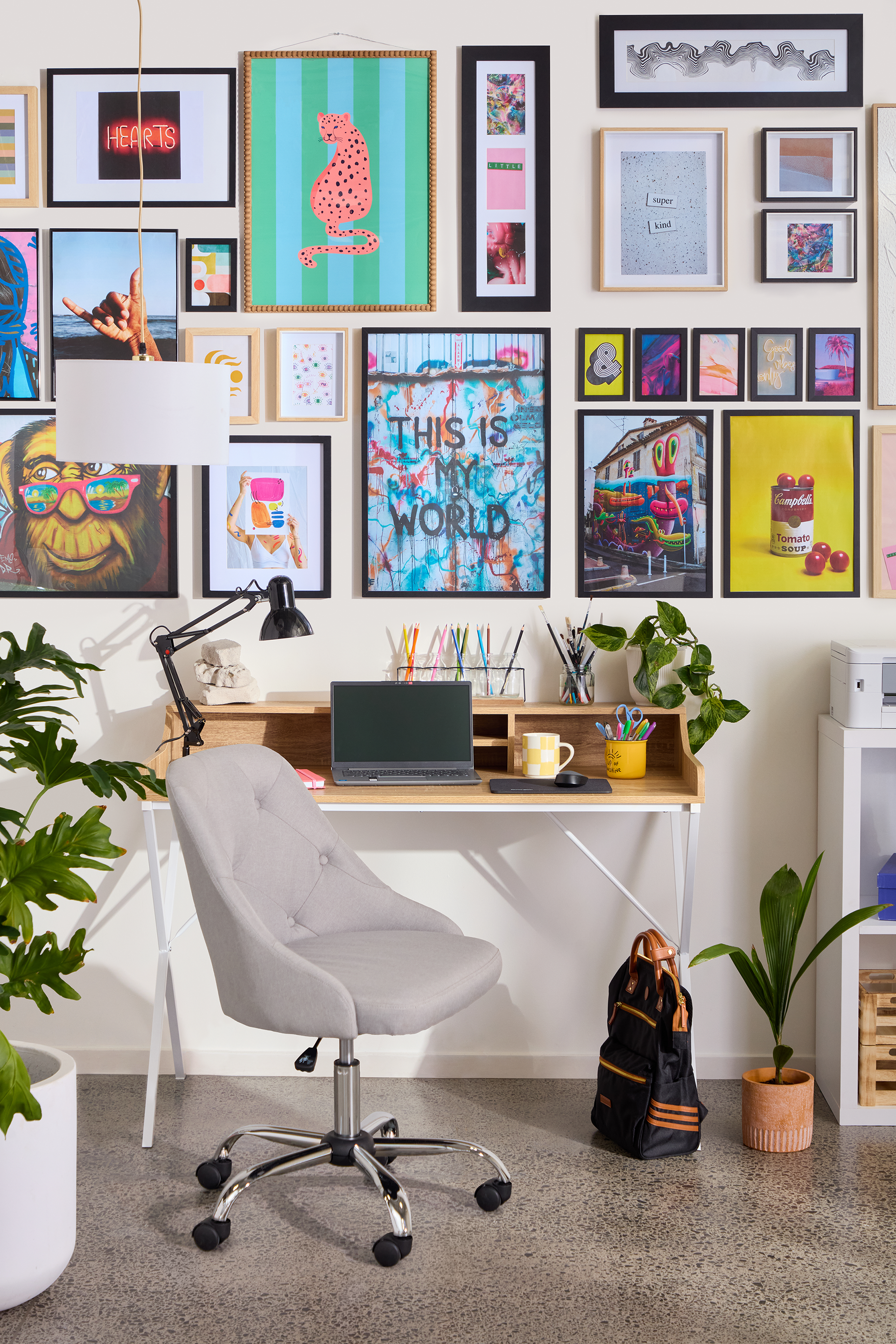
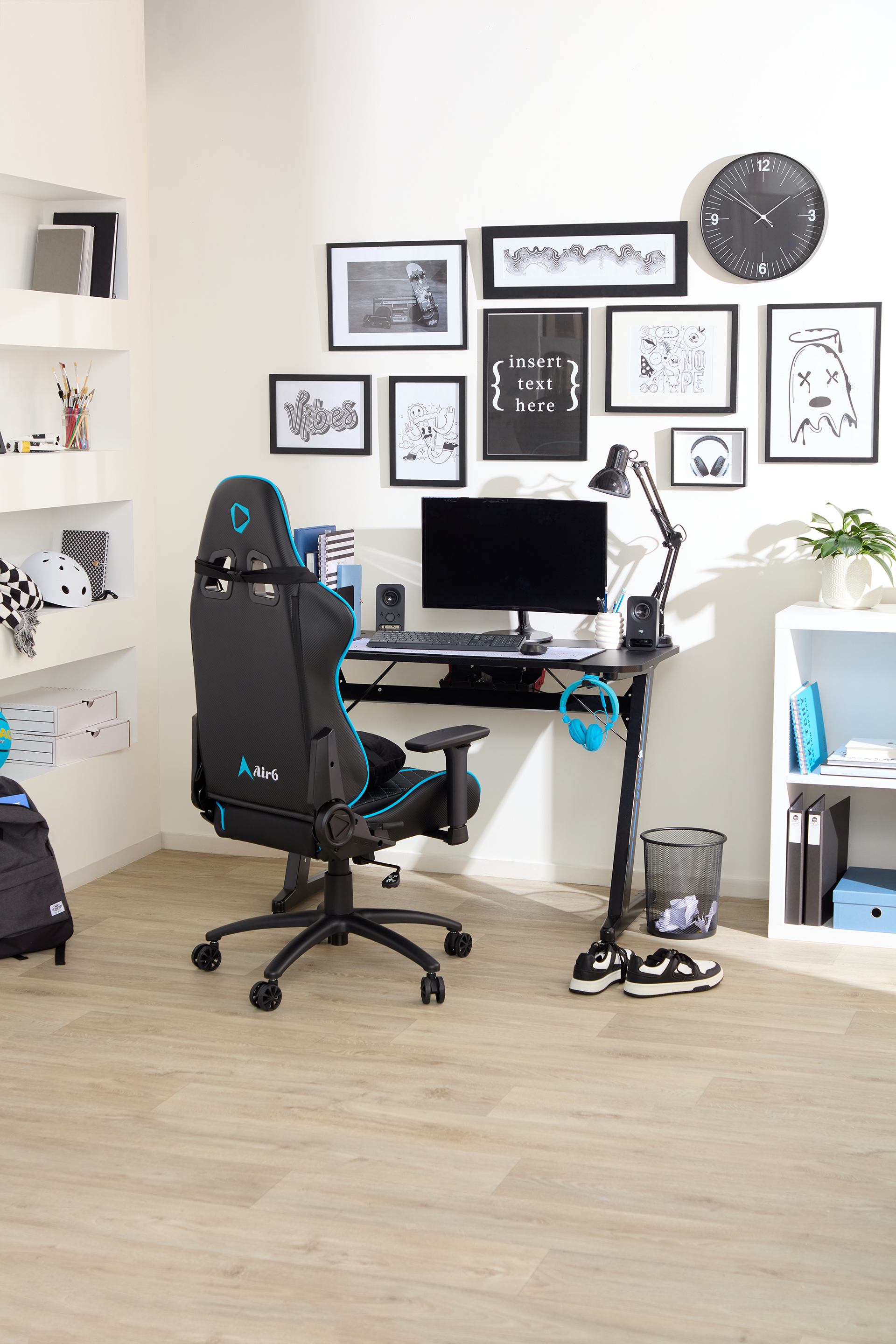
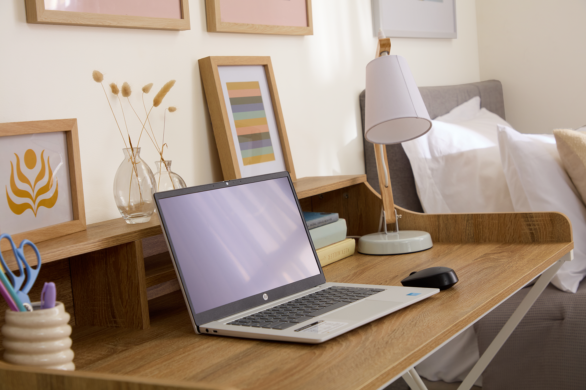
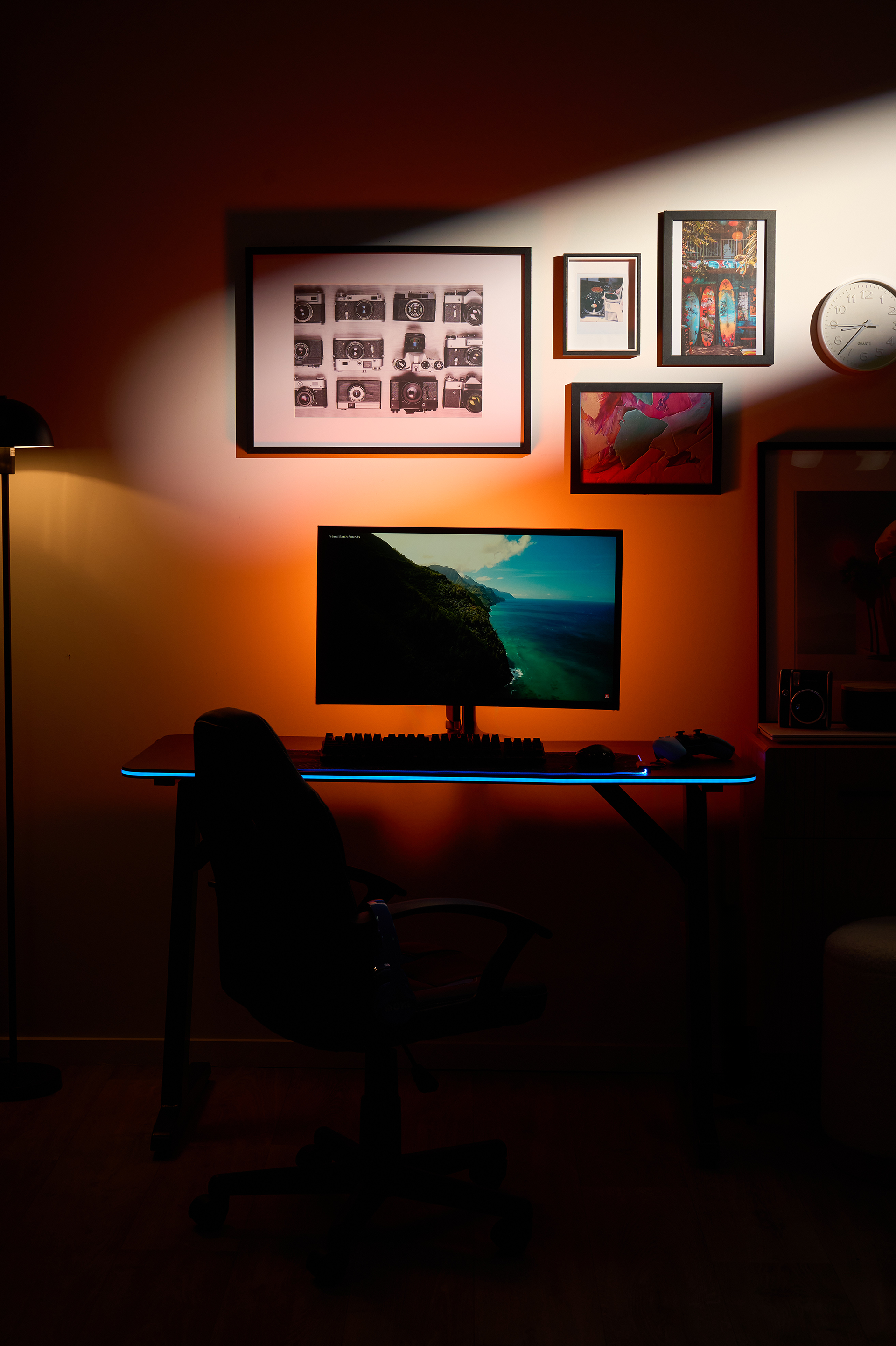
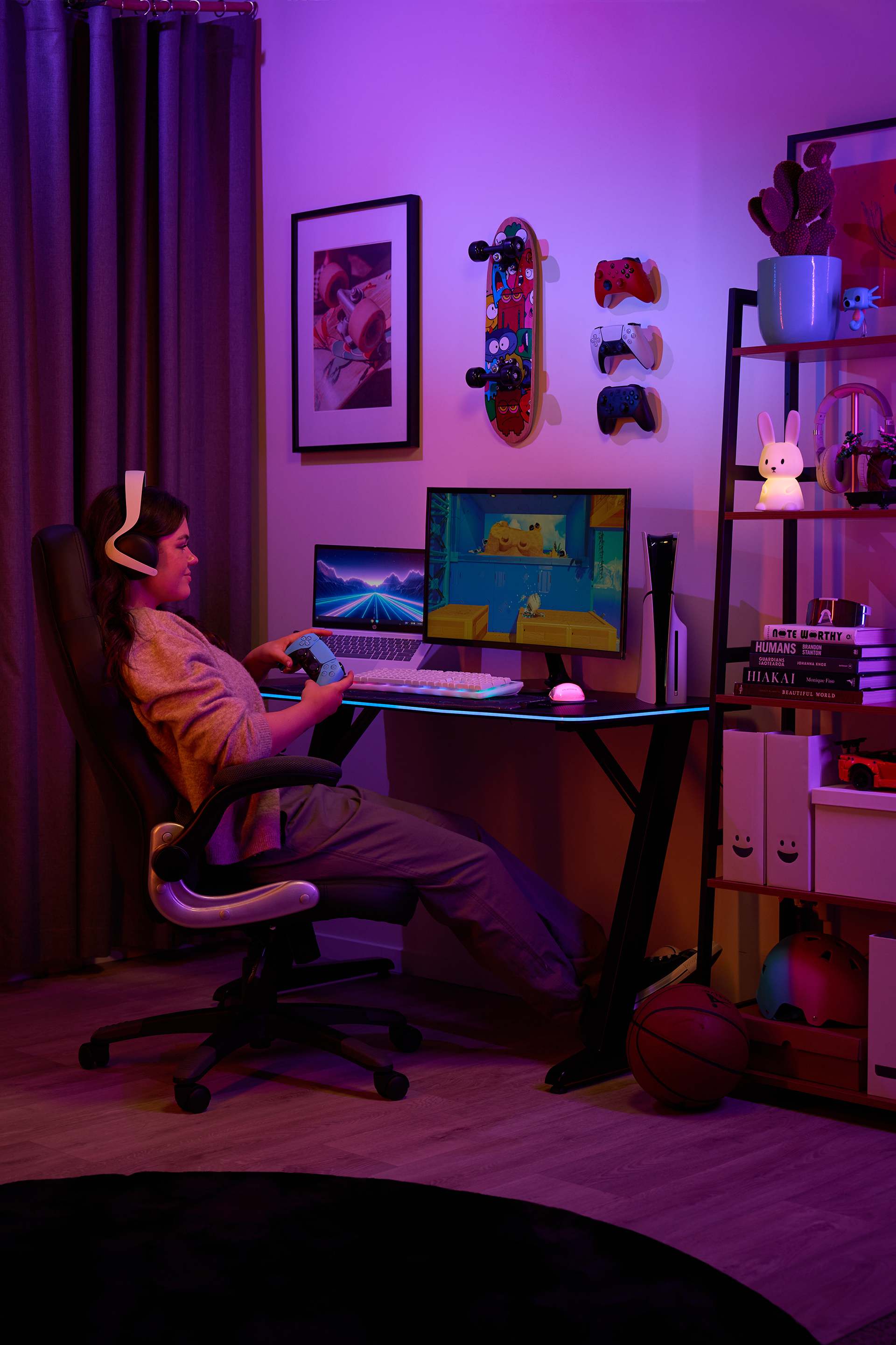
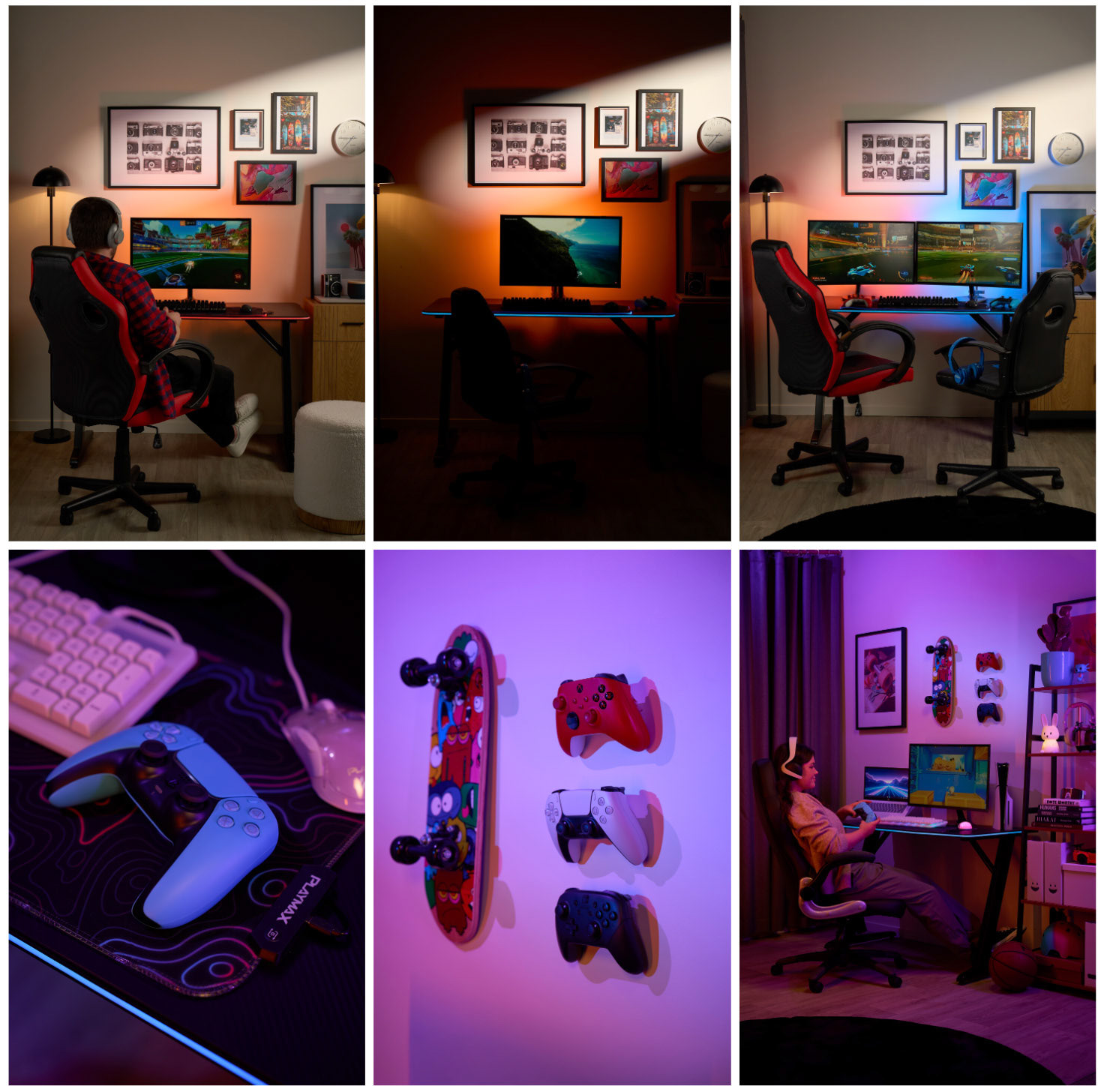
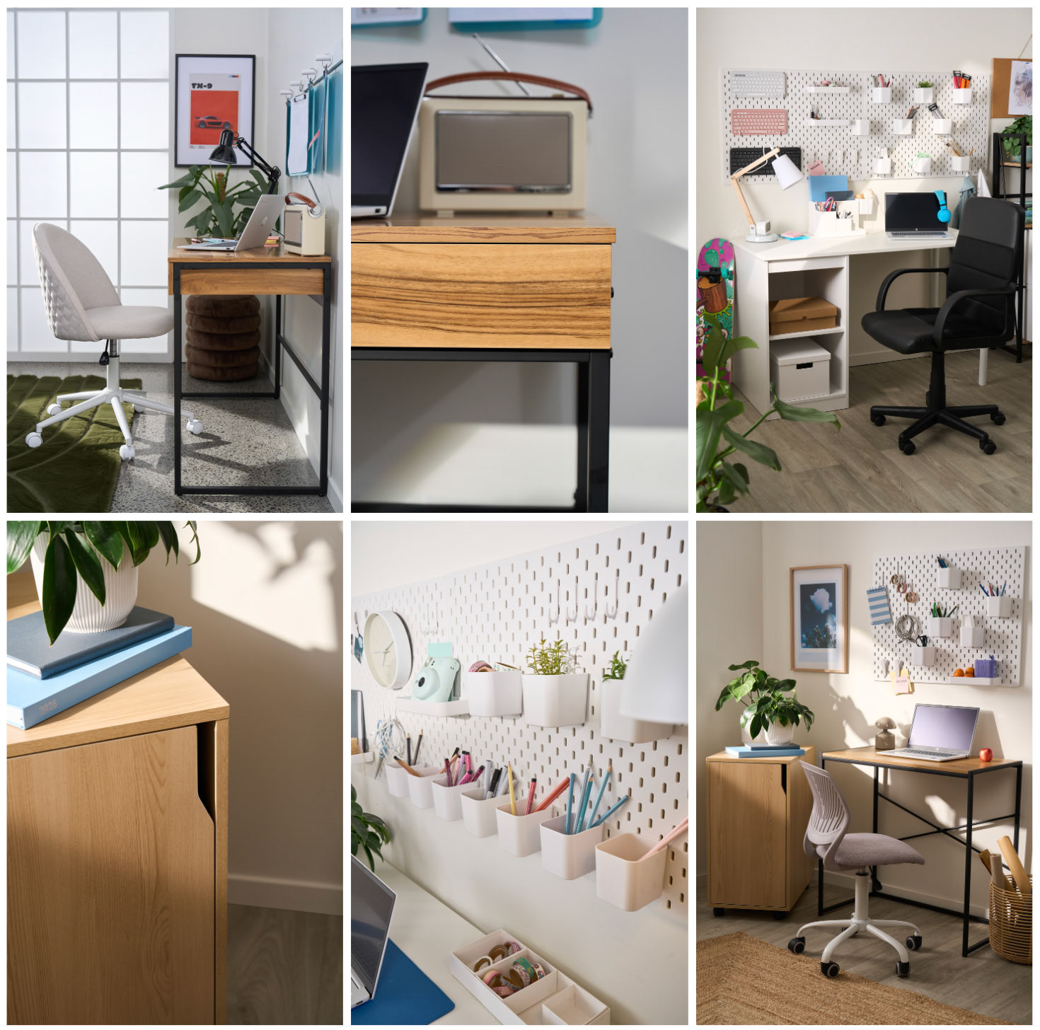
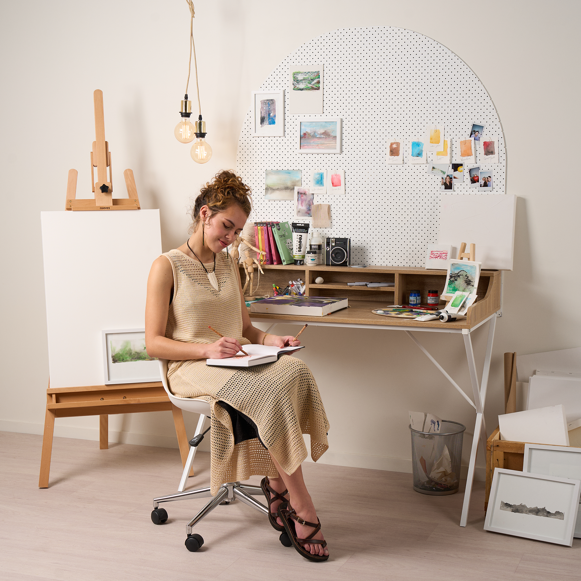
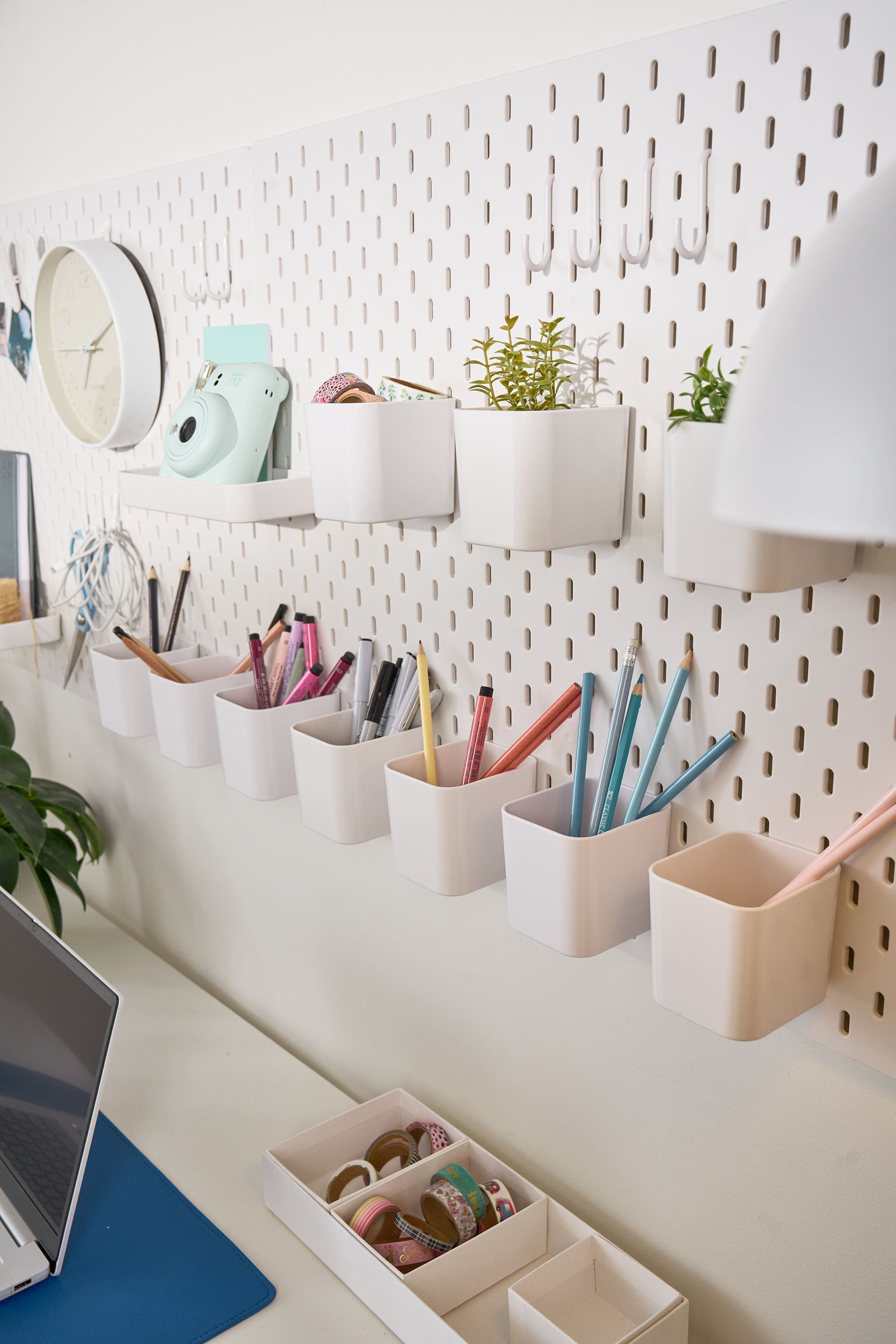
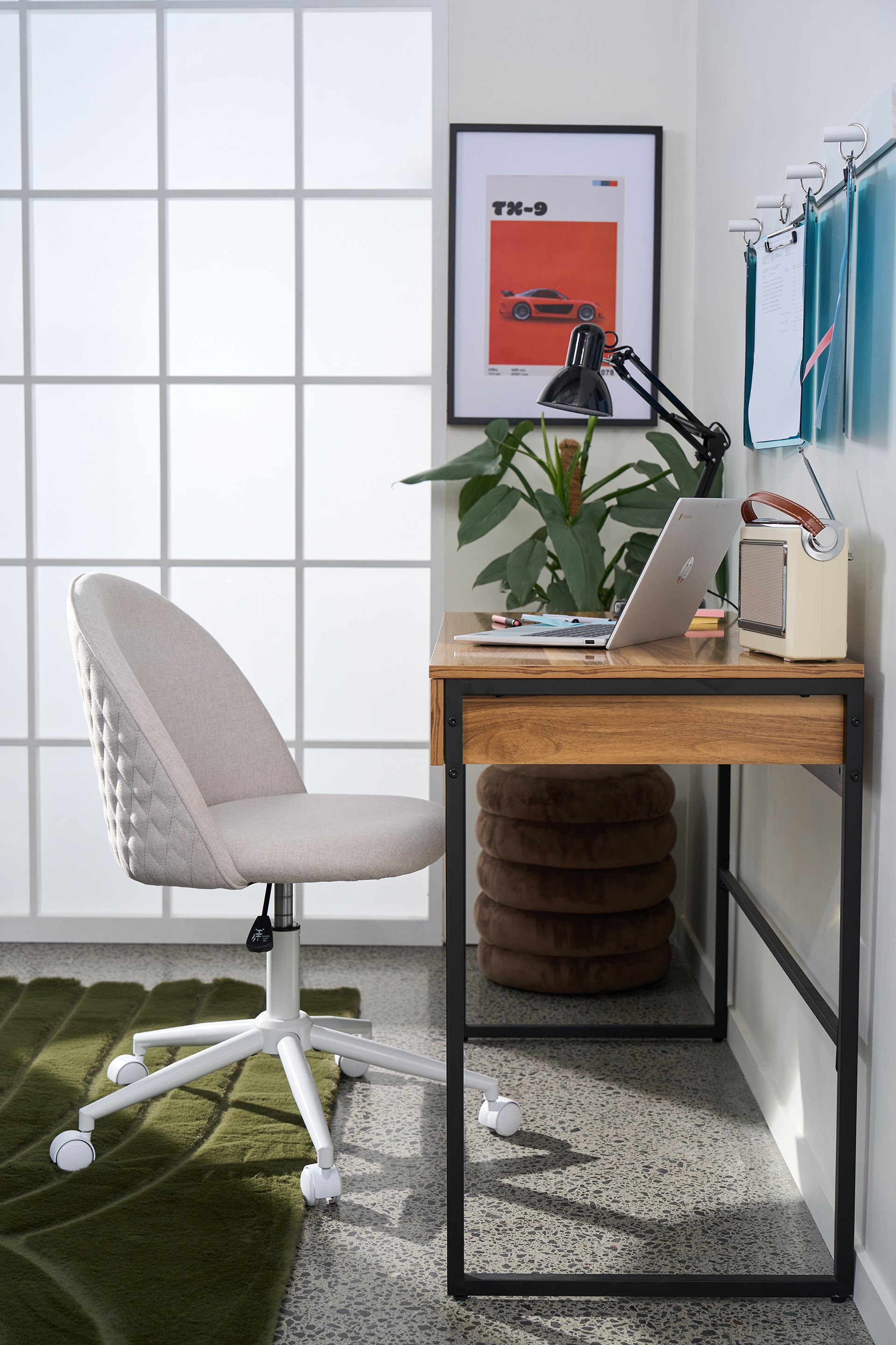
The Workspace Edit
Styling: Lauren Olive | Videography & Photography: Tom Witte
A digital lookbook exploring home office furniture through real-world use rather than showroom perfection.
The project reframes a single product range across different work styles, from calm Scandinavian-inspired spaces to high-performance gaming setups, showing how the range adapts to real homes and real ways of working.
Developed as an editorial extension of the More Than a Flatpack positioning, reinforcing Warehouse Stationery as a practical and design-conscious workspace solution.
-----------------------------------------------------------------------------------------------
Seasonal Campaigns
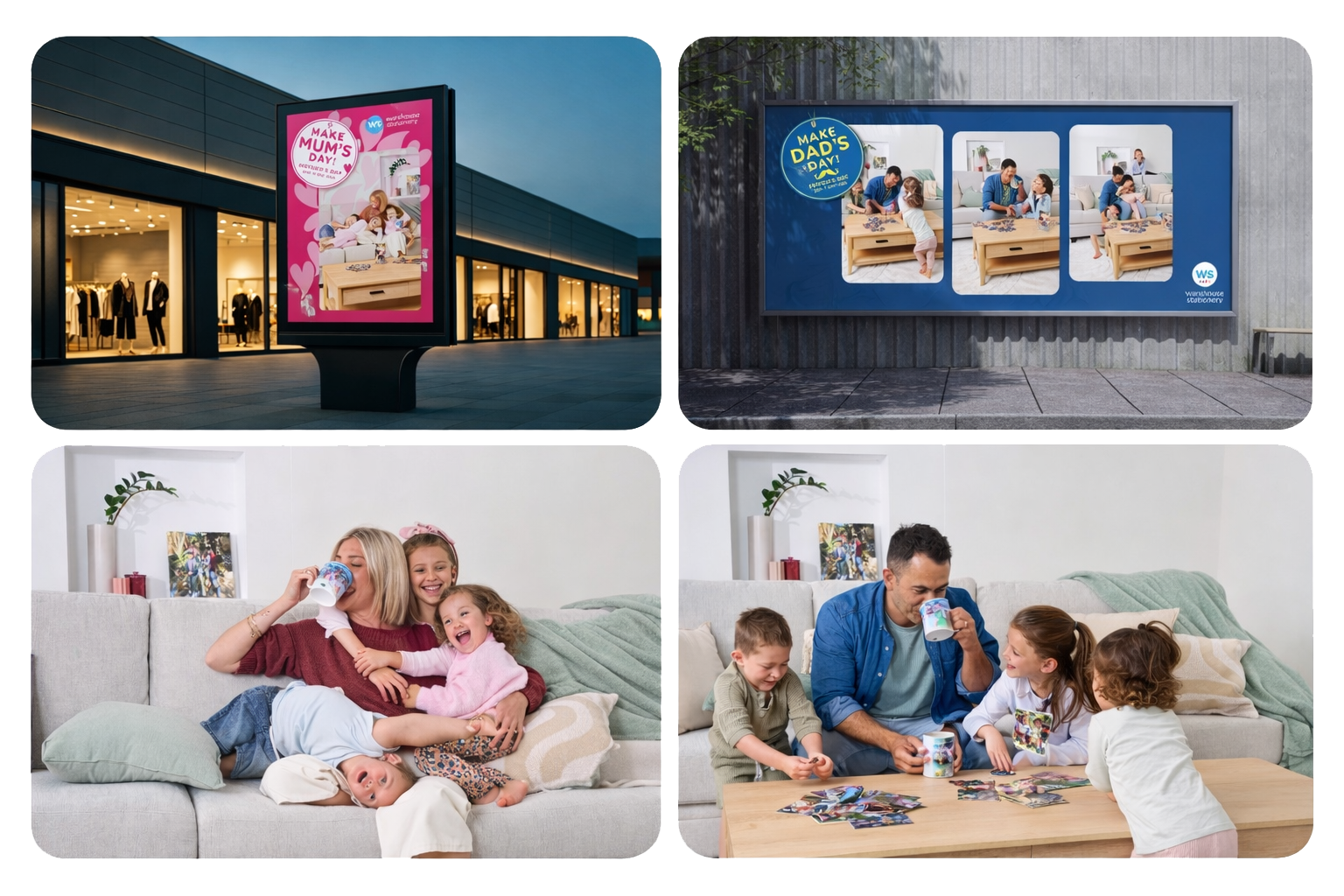
Mother's Day & Father's Day Gifting Campaigns
Styling: Lauren Olive | Videography & Photography: Tom Witte
Seasonal gifting is a crowded retail space often dominated by predictable, sentimental messaging. The opportunity was to create campaigns that felt authentic, recognisably Kiwi and highlighted personalised gifting in a more meaningful way.
I led the creative direction across concept, visual language and shoot direction, developing campaigns centred on real family moments rather than staged perfection.
Natural, candid photography captured the small interactions that make these days meaningful. The work rolled out across TVC, social, digital, print and in store, helping position personalised gifts as thoughtful, accessible and genuinely personal.
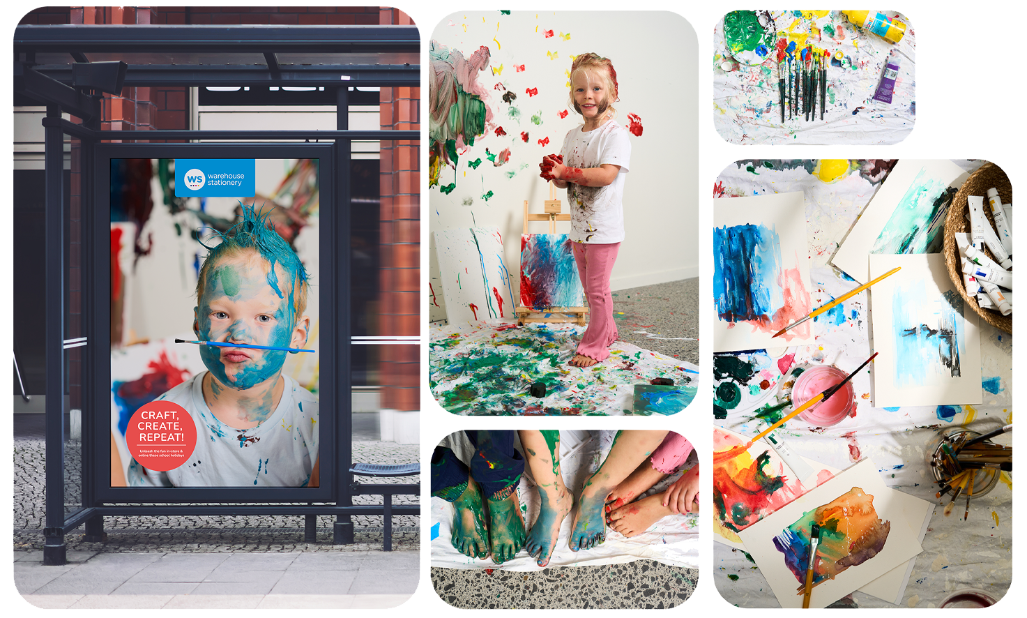
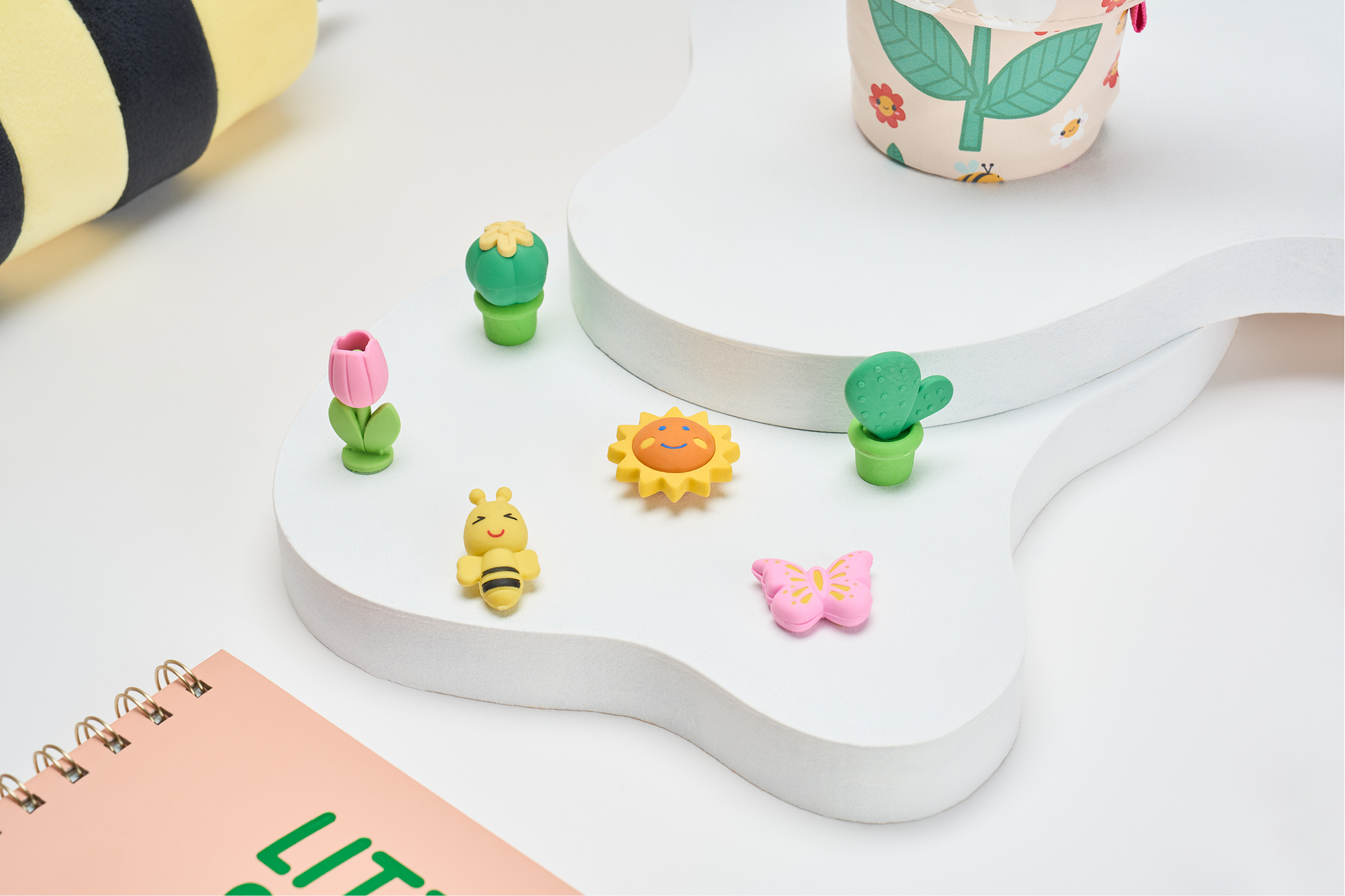
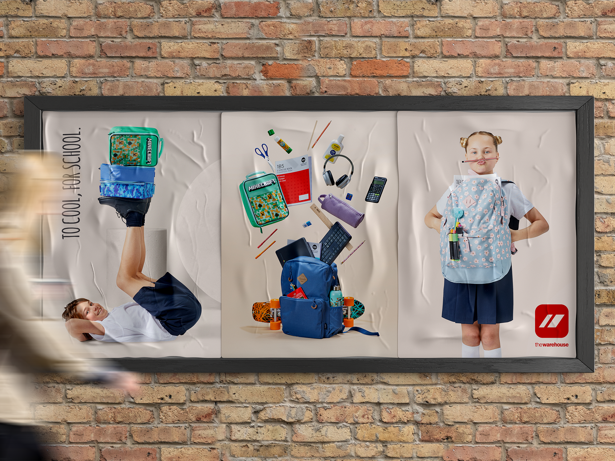
School Holidays - Craft, Create, Repeat
Styling: Andrea Moore | Videography & Photography: Tom Witte
Warehouse Stationery’s school holiday campaigns compete in a crowded retail moment where most creatives feel generic. The opportunity was to celebrate the real energy of kids making, crafting and creating.
I led the creative direction across concept, visual language and shoot direction, developing a campaign that embraced the messy joy of creativity rather than polished craft aesthetics.
Shot with real kids and their friends, the work captured spontaneous, chaotic moments of art play. Bright, energetic photography and video rolled out across social, digital and in-store, positioning Warehouse Stationery as the home of school holiday creativity.
-----------------------------------------------------------------------------------------------
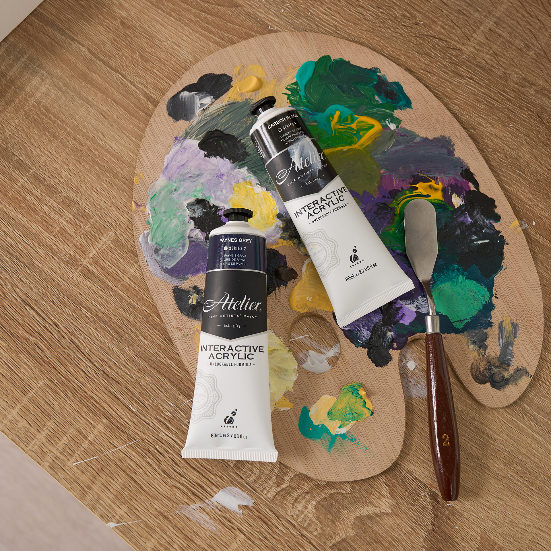
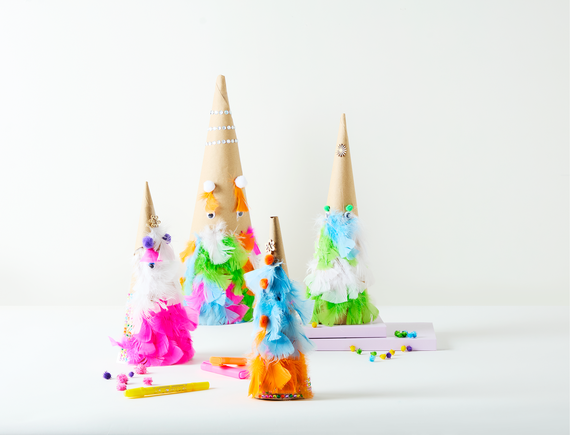
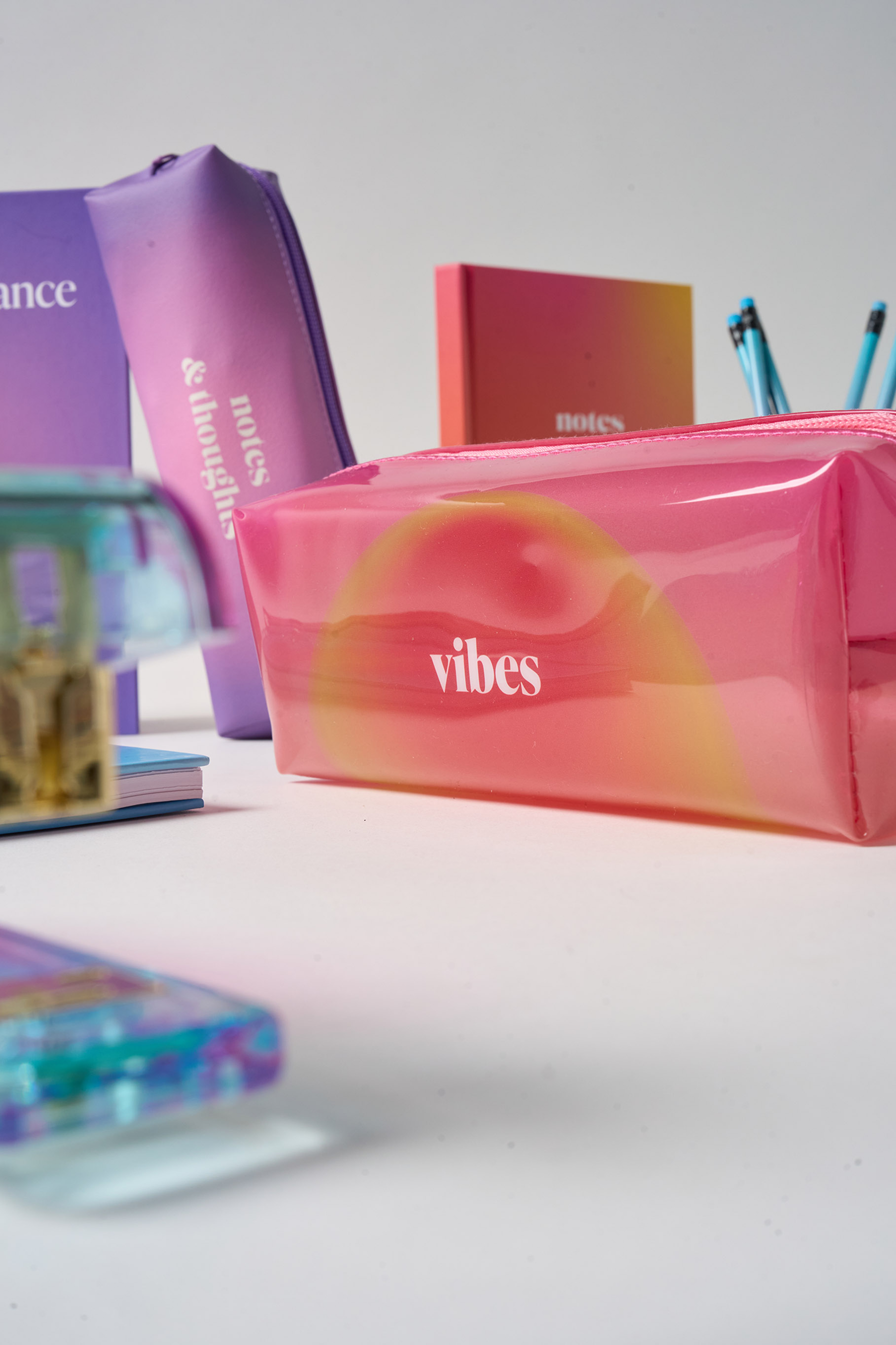
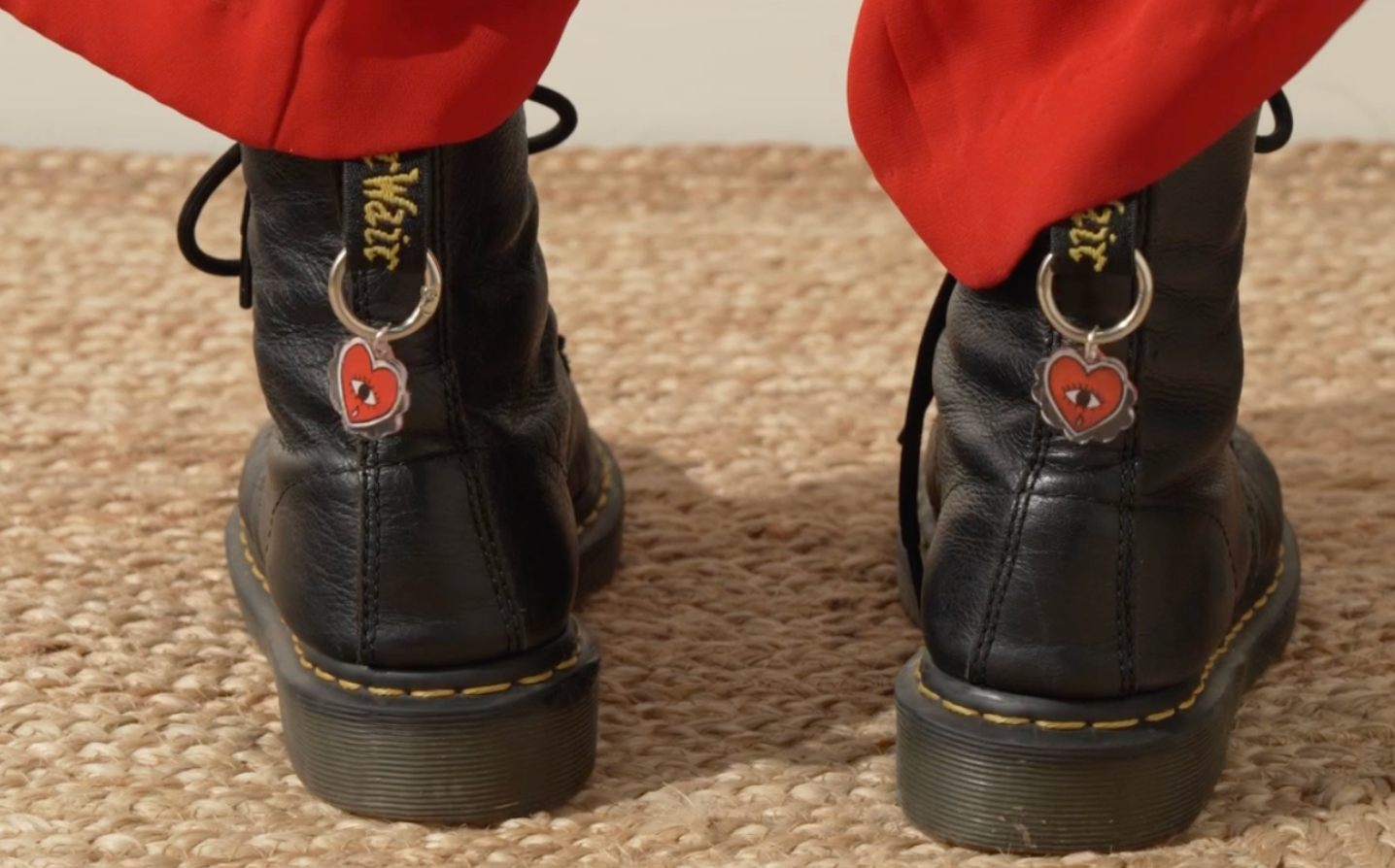
Social Content.
Warehouse Stationery’s social presence needed a clearer point of view. The goal was to create a recognisable visual identity that could cut through a crowded feed and turn everyday products into engaging content.
Working closely with styling, photography and studio production, I developed repeatable content systems that balance brand storytelling with commercial outcomes.
The result is a more confident and consistent social presence, with elevated photography and distinctive brand cues that make Warehouse Stationery instantly recognisable in feed.
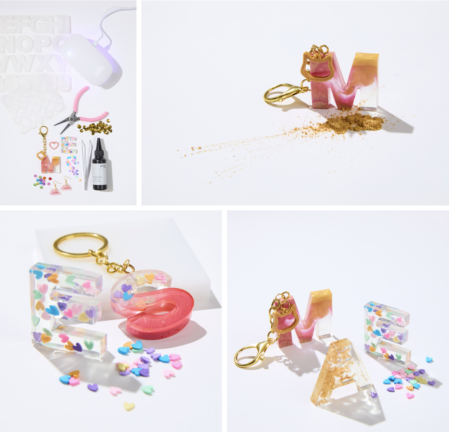
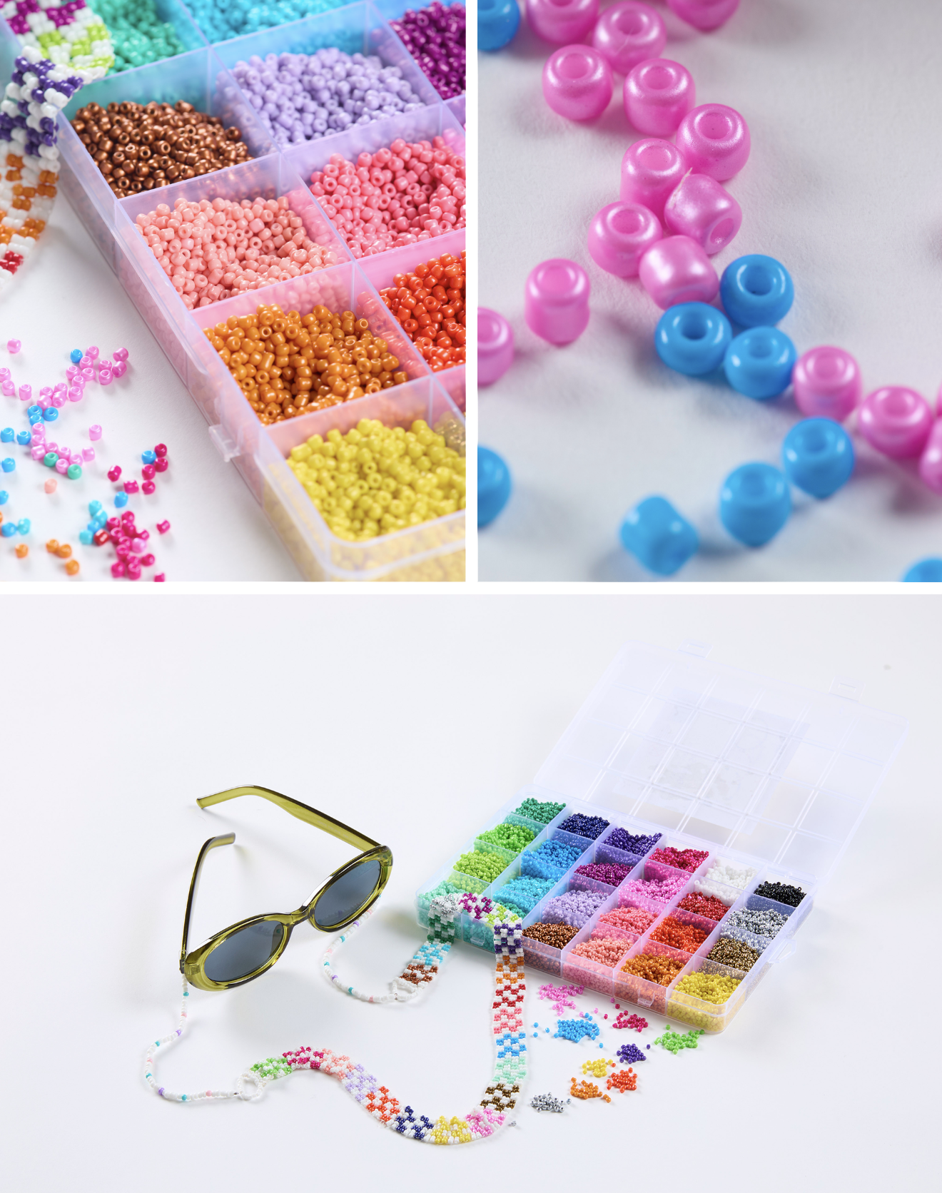
Resin & Beads
Stylist: Rosie Galbraith | Videographer: Thomas Witte
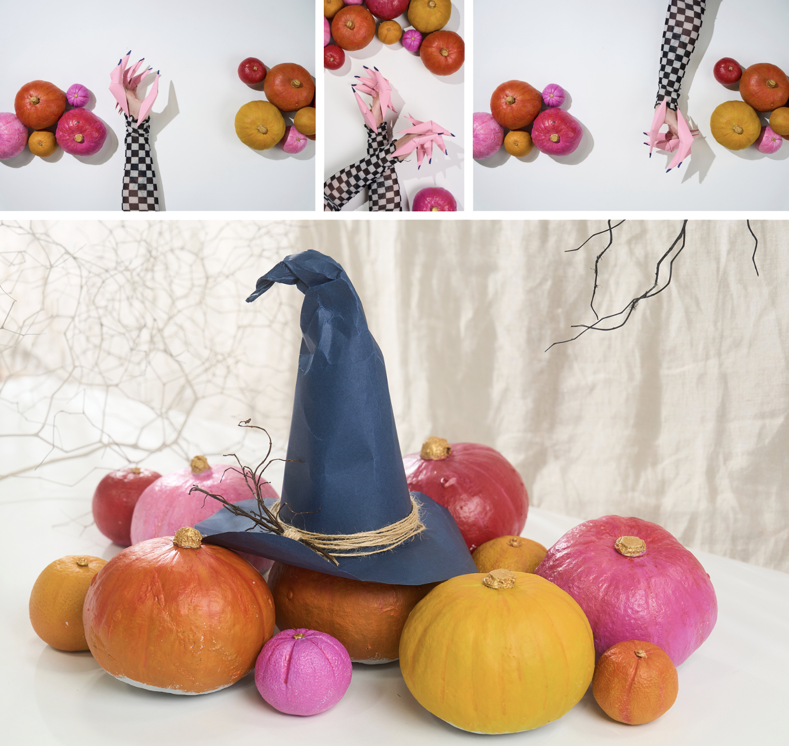
Halloween Art & Craft
Stylist: Rosie Galbraith | Videographer: Thomas Witte
-----------------------------------------------------------------------------------------------
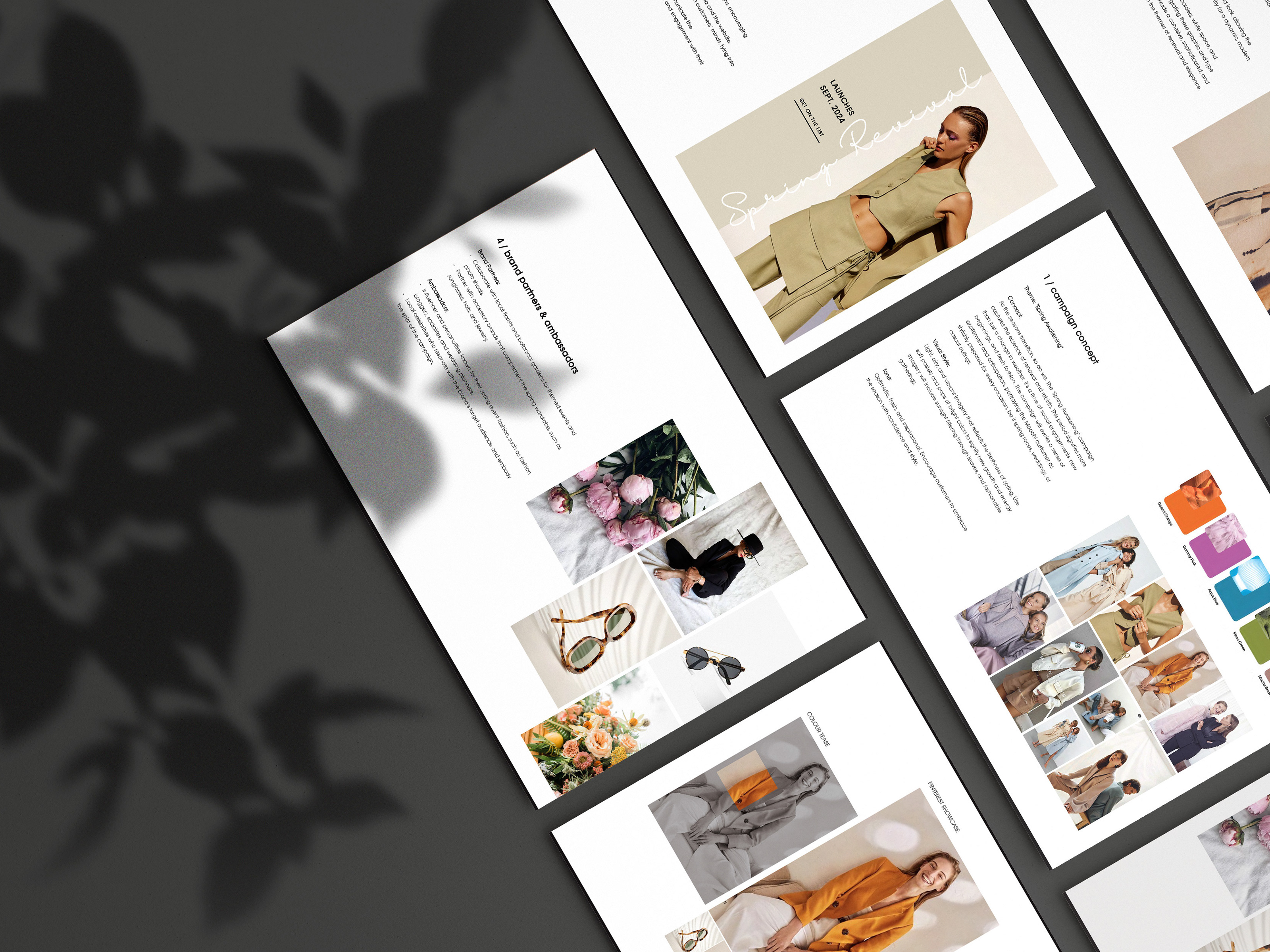
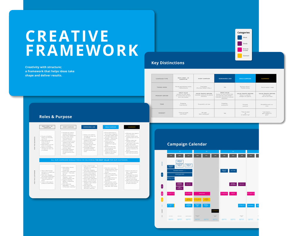
Creative Framework.
Creative strategy and framework development guiding brand, print, digital, social and OOH.
Warehouse Stationery needed a clearer system to align creative thinking across the business. Years of shifting priorities and siloed outputs meant the brand lacked cohesion across campaigns and channels.
I developed a new Creative Framework from the ground up, a strategic blueprint that defines how the brand shows up creatively. The framework establishes content pillars, visual direction and tone while introducing practical tools and templates teams can use across marketing and campaign production.
Designed to support creativity rather than restrict it, the framework provides clear guardrails while leaving room for experimentation and evolution.
Today, it acts as a foundational tool across the business, helping teams create work that is more cohesive, confident and consistently on brand.
Note: visuals shown are draft work in progress as the framework continues to evolve.
-----------------------------------------------------------------------------------------------
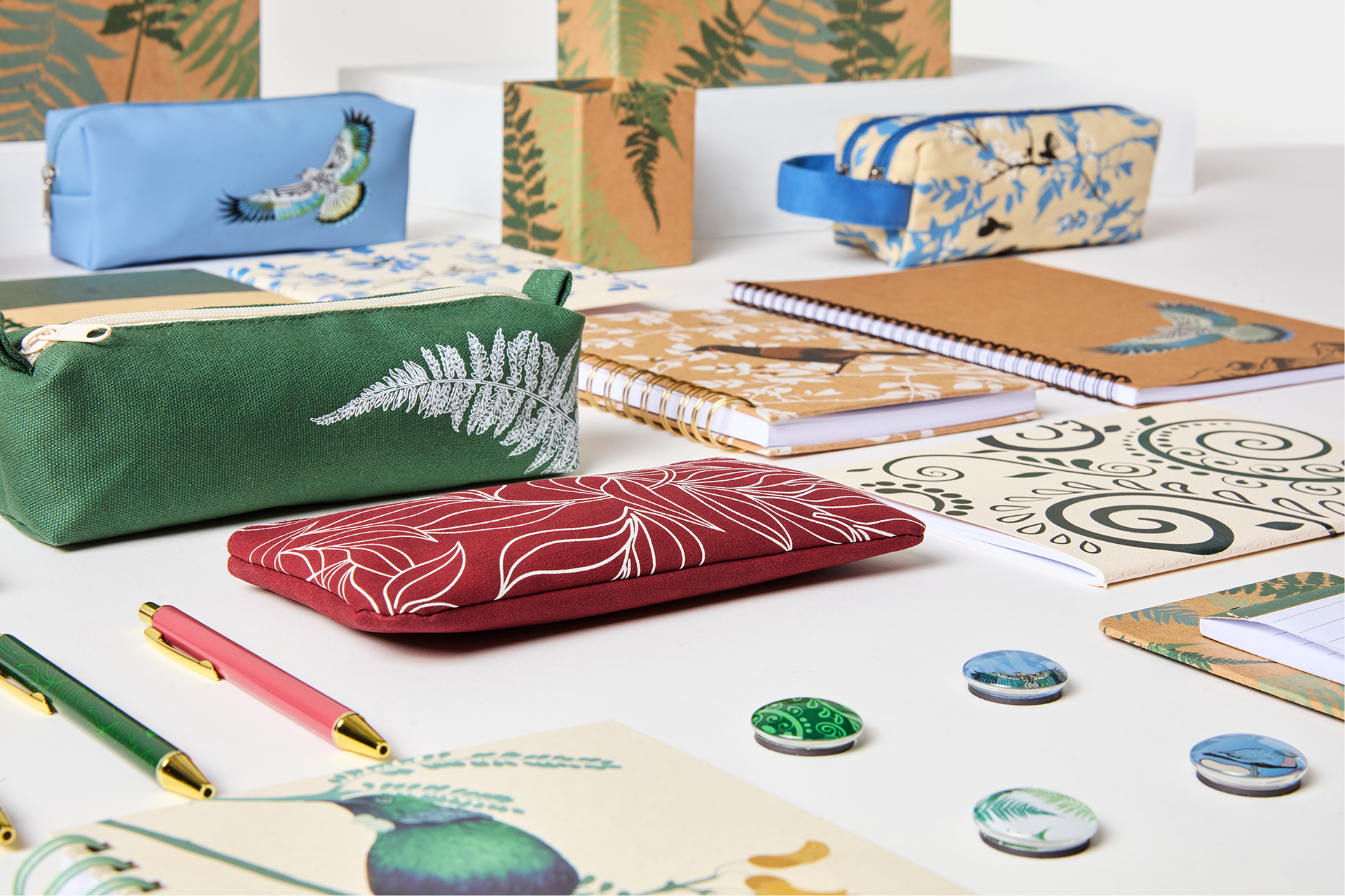
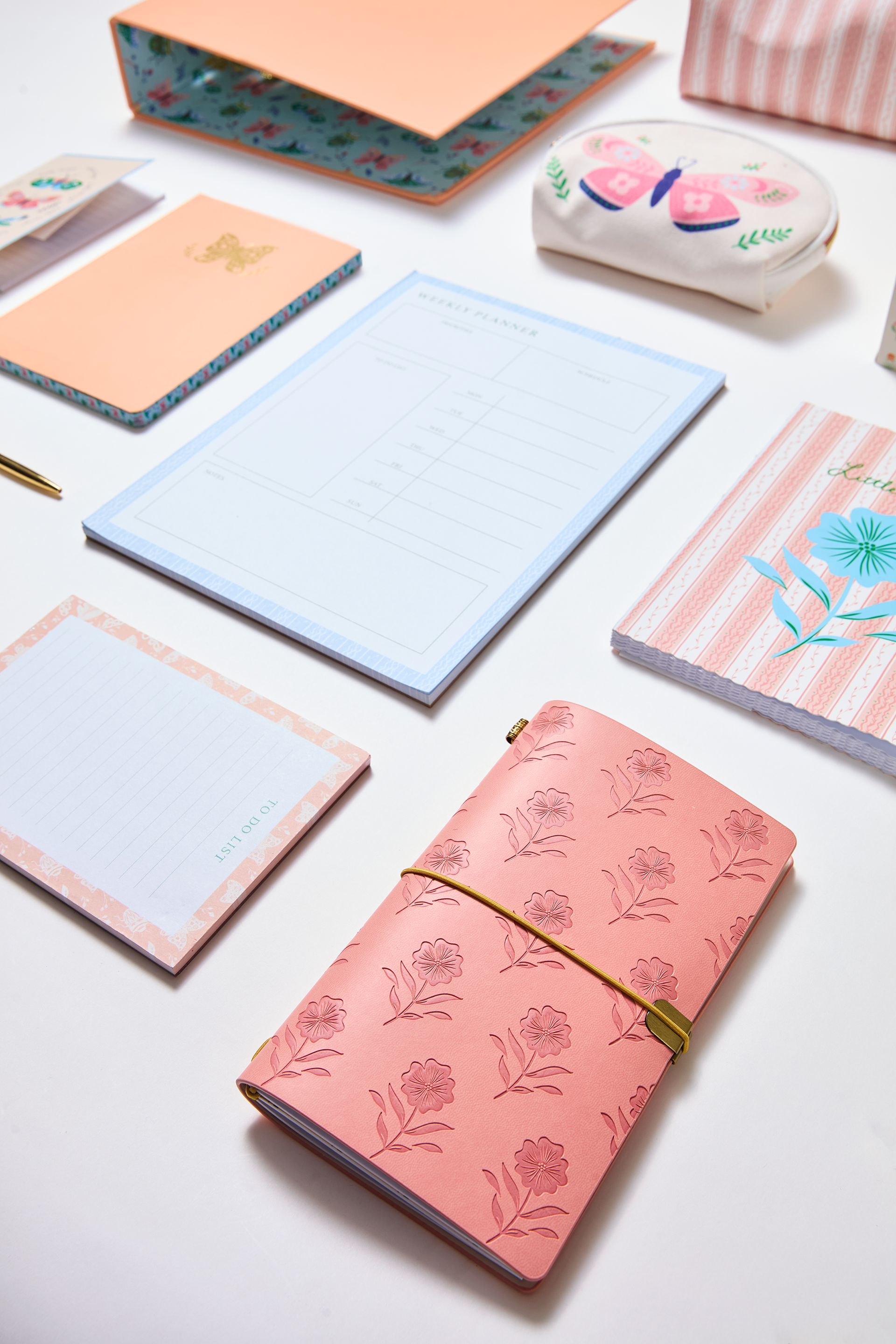
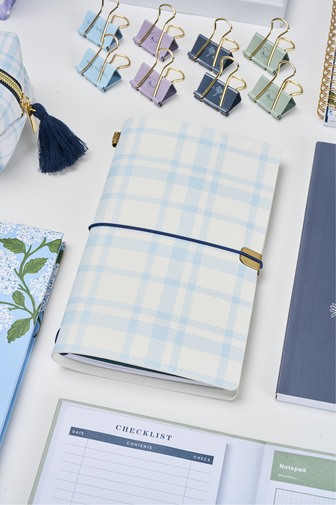
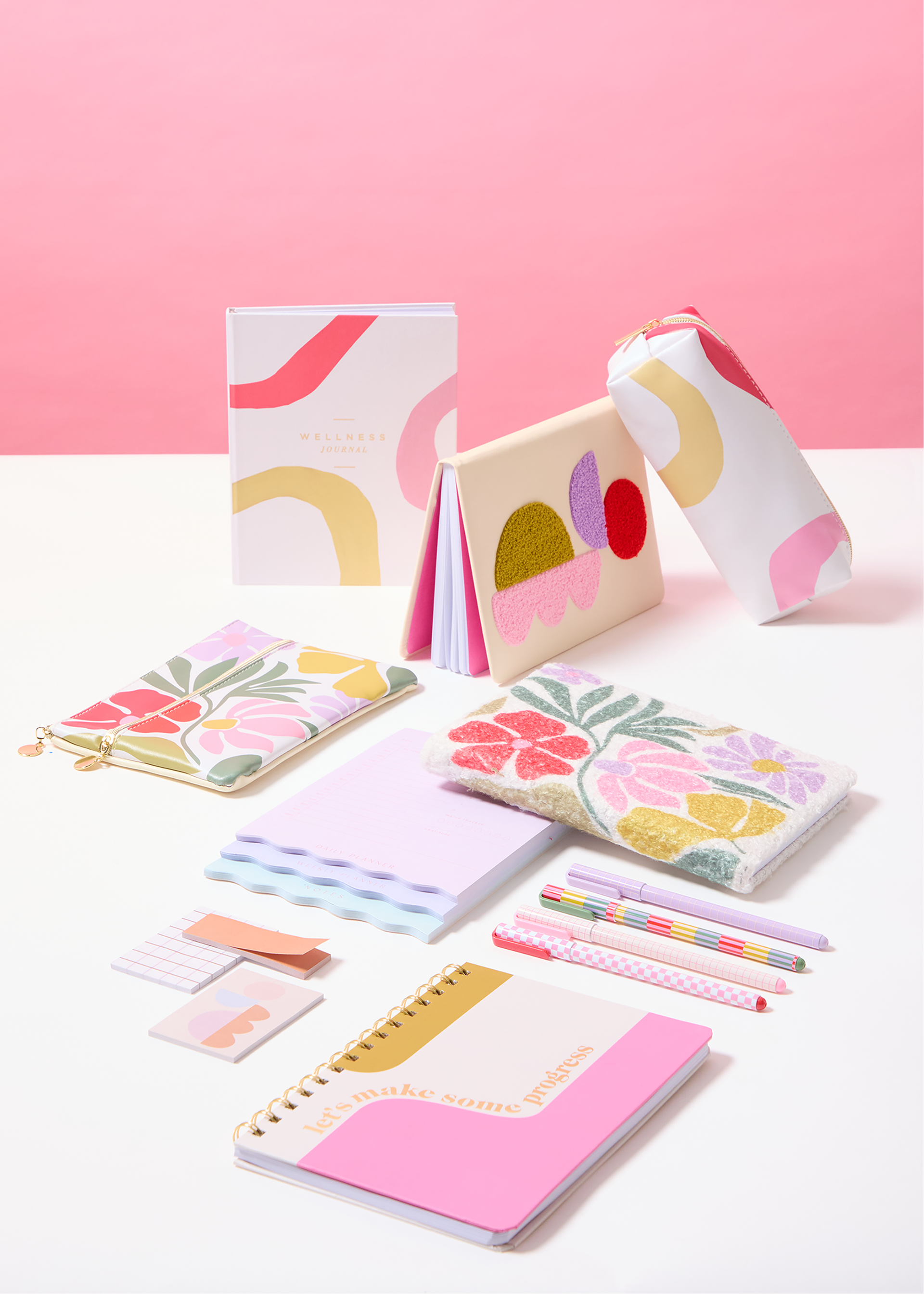
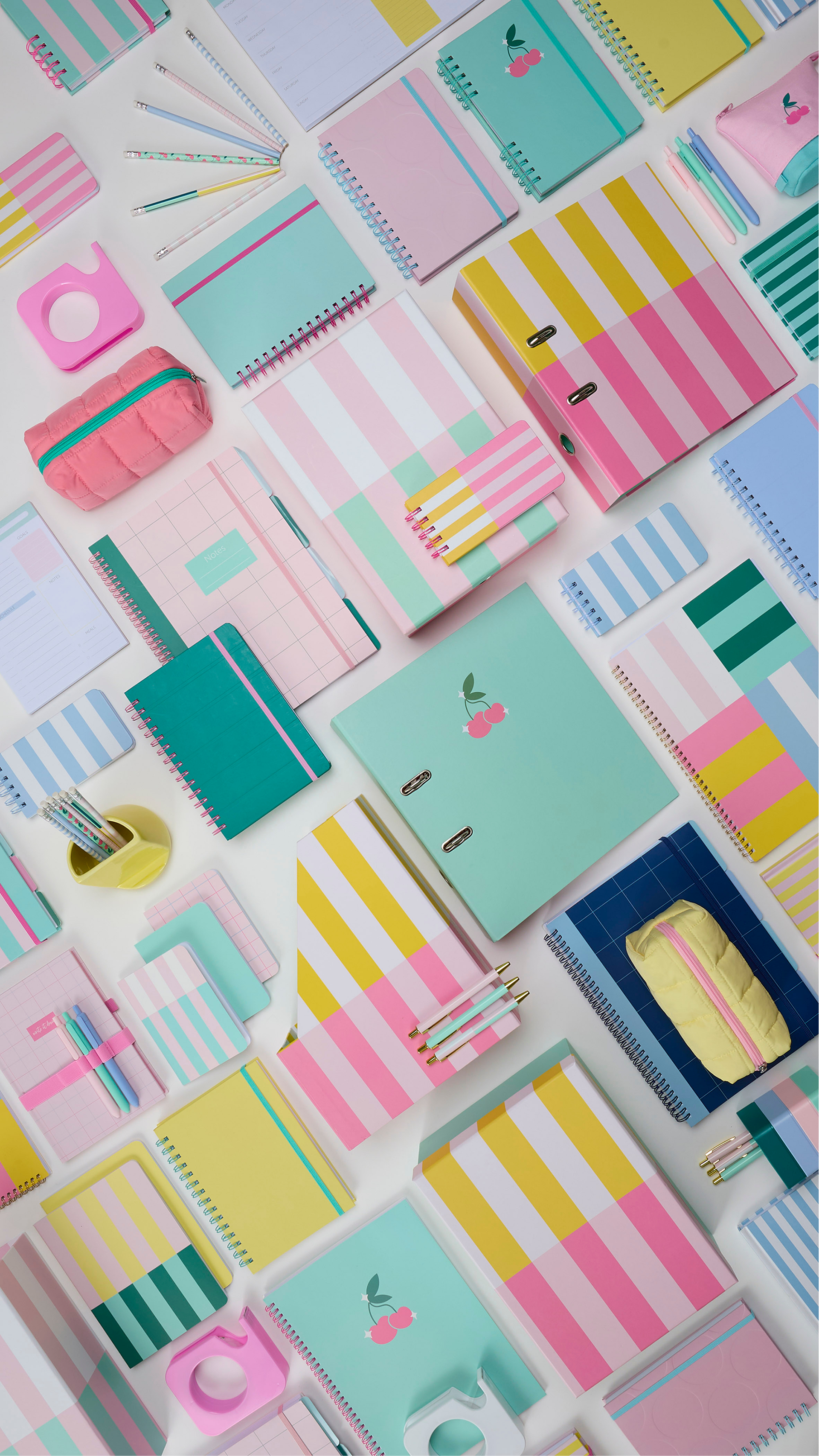
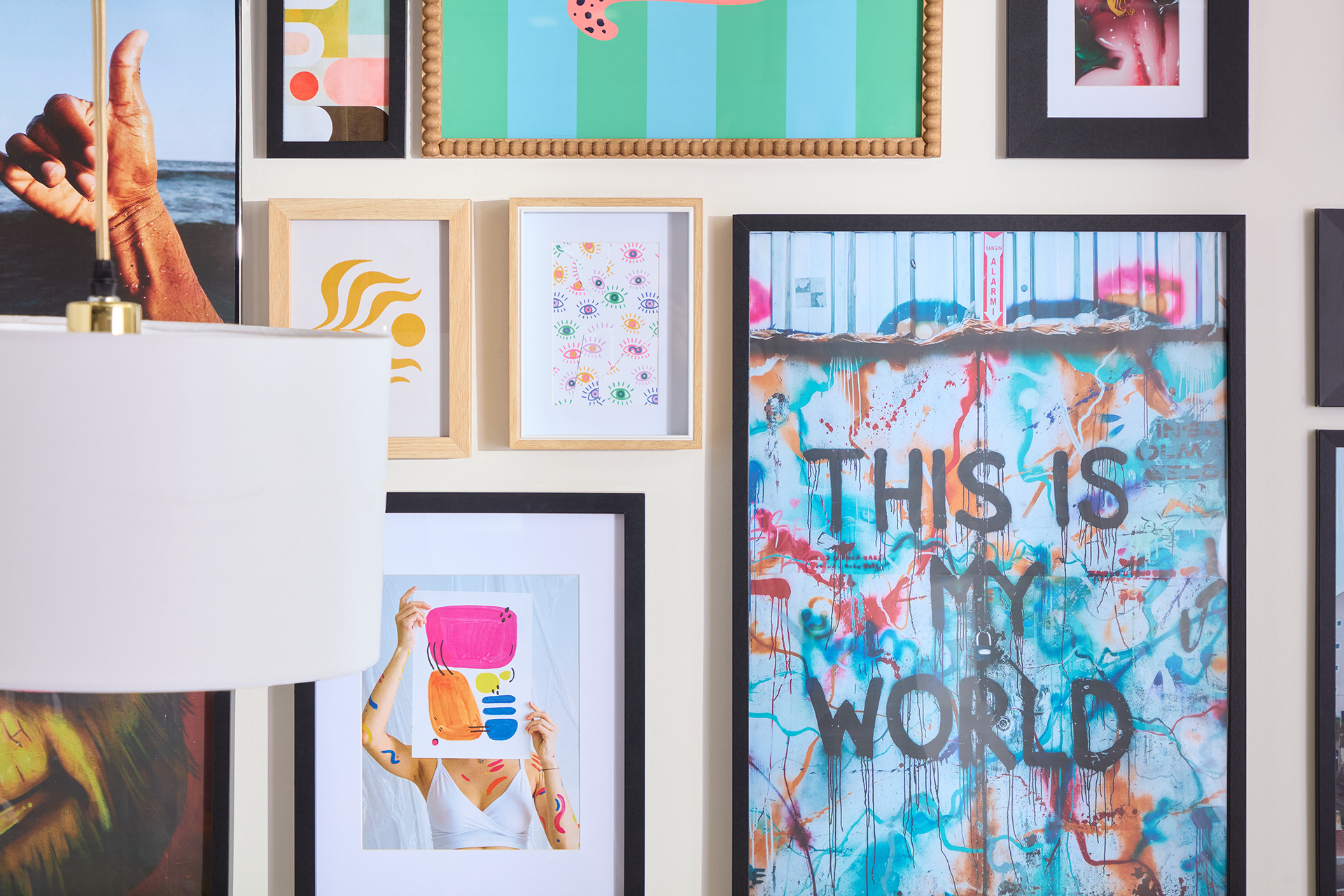
Brand Photography and Visual Direction.
Creative direction and brand strategy across photography, social, digital, print, OOH and in store.
Warehouse Stationery needed more than a refresh. Years of fragmented creative had diluted the brand, and the opportunity was to rebuild a visual identity that felt relevant, confident and recognisably Warehouse Stationery.
As Creative Director, I led the brand’s visual revitalisation across strategy, guidelines and execution. This included redefining core brand codes, rebuilding the visual language and directing photography across campaigns and everyday brand content.
The work reframed everyday products through more expressive storytelling, elevating stationery, craft and workspace items beyond purely functional retail.
The result is a clearer, more cohesive brand presence across channels, supported by stronger photography, refreshed guidelines and a consistent visual system that brings new energy to the brand.